Redefining Beautiful for Online Retail
Many businesses invest heavily in making their website beautiful.
They brief agencies on visual impact. They review mock-ups. They debate fonts, colour palettes, animation styles and homepage layouts.
And yet, after launch, performance underwhelms...
- Conversion rates stall
- Bounce rates remain high
- Revenue targets are not achieved
The problem isn’t the execution. The problem is the definition.
Most businesses define beautiful incorrectly.
The Video!!
Would you prefer to watch a video version of this article?? Click on the YouTube video below to watch the video version of this article.
If not, the rest of the article is presented in detail below.
Luxury Retail:
Luxury retail often uses incorrect definitions of beauty, which is one reason it has been slow to capitalise on the digital retail opportunity.
Research from the Nielsen Norman Group confirms that luxury brands feel they can "play by their own rules" when designing digital experiences for humans.
Beauty is in the eye the beholder, and the beholder is your customer
Defining Beautiful:
Beauty in eCommerce is not about visual appeal alone. Business leaders need to pause and recognise that the true beauty of an online retail site lies in how it helps consumers meet a need.
Consumers do not visit your website to admire it.
They come to you to...
- Find information
- Compare options
- Reduce risk
- Make decisions that matter to him/her
- Select and purchase the right product
If your website looks impressive but impedes humans' ability to achieve the above, it is not beautiful.
True digital beauty is measured in the 4 C's:
- Convenience (ease of use)
- Convention (leveraging what's known)
- Clarity (in product)
- Confidence building
The new brand strategy is how consumers feel after engaging with you, and whether you met their needs.
Below is a deeper dive into these 4 C's...
#1. Convenience is Beautiful:
Convenience or ease of use is where consumers value simplicity more than originality.
A beautiful website:
- Makes navigation obvious
- Works intuitively across devices
- Loads quickly
- Presents information in a logical hierarchy
- Requires minimal thinking to undertake multiple steps in a journey (reducing cognitive load)
When a customer does not need to apply mental effort to figure out how your website functions, trust increases.
Being unique within the realms of usability best practices is fine. But reinventing navigation patterns, hiding key actions (such as your site search box) or prioritising minimalism over discoverability reduces engagement.
Hiding critical desktop navigation elements may look clean, but it reduces visibility of your product range and increases friction.
Below is an example of this in action...
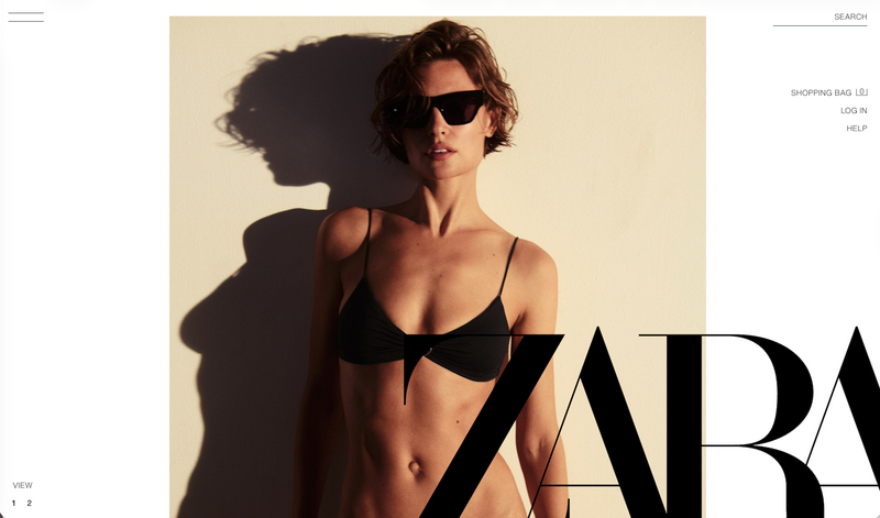
Figure 1

Figure 2
The absence of convenience is directly correlated with a reduction in online revenue.
Usability is not a design preference. It is a commercial discipline.
#2. Convention Is Beautiful:
Consumers are trained, and they expect:
- The site search elements to be in a certain location
- Site search suggestions to be presented in a certain way
- Navigation elements to be structured and presented in a certain way (for both desktop and mobile screens(
- The cart icon in the top right of the header
- Filters on product listing pages
- Clear calls to action on product pages
- Predictable checkout steps and payment options
These conventions exist for a reason. They reduce learning time for consumers.
When businesses attempt to differentiate by breaking established patterns, they increase cognitive load (mental effort).
Creativity has a place, but when it comes to designing digital experiences, page layouts, and the behaviour of functional elements, it's beautiful when familiarity is prioritised.
IKEA Example:
IKEA has applied an elegant mix of visual content and functional conventions to present a navigation system that is meaningful to consumers.
This brand-conscious retailer has produced a product-focused presentation of their desktop navigation features (see Figure 3 below).
These product categories are visually emphasised in a tile format, and because the human brain is engineered to engage with visual content over the written word, this navigation treatment will drive the right type of engagement.
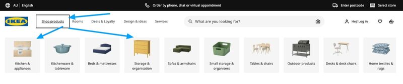
Figure 3
IKEA also knows consumers shop by "Room Type", so they have created a second visual navigation system representing all the relevant room types, see Figure 4 below.
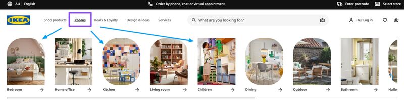
Figure 4
The mobile version features the product type navigation system at the top of the page, with clear elements to prompt scrolling: see Figure 5 below.
IKEA's mobile menu navigation is beautifully designed to create large, finger-targeted category buttons to simplify selection: see Figure 6 below.
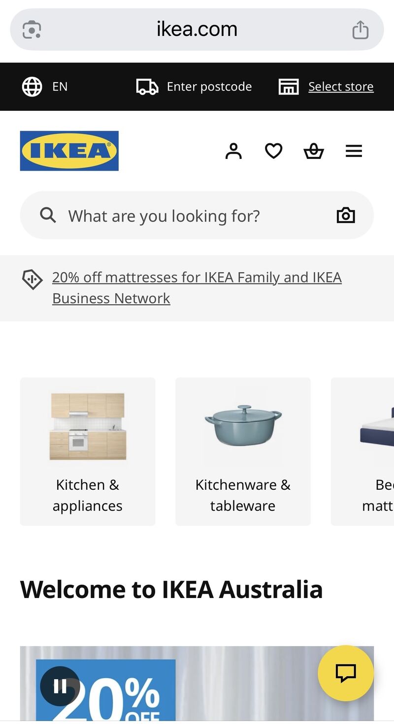
Figure 5
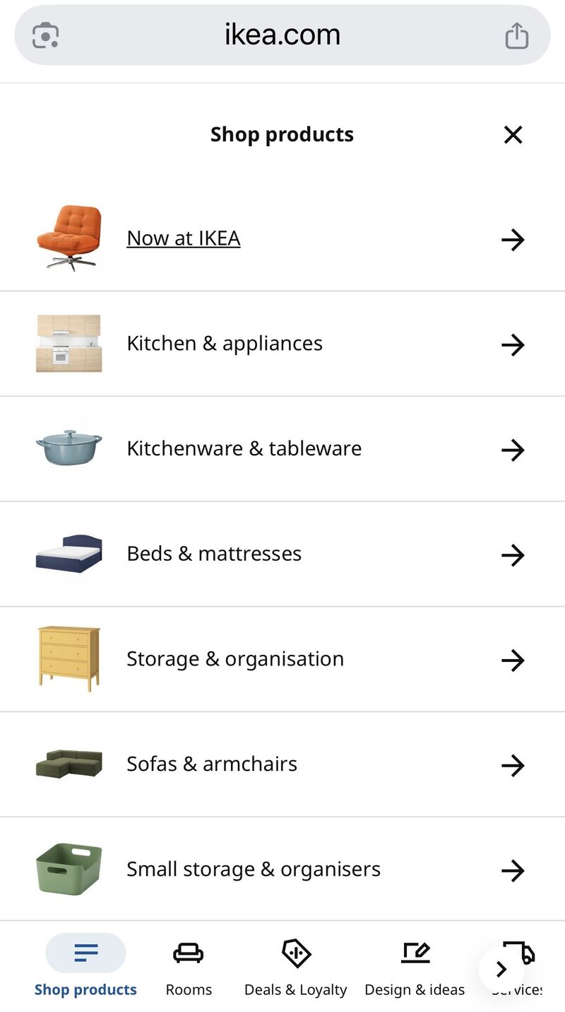
Figure 6
#3. Clarity in Product is Beautiful:
Underperforming eCommerce sites have one thing in common: insufficient product content.
Customers need more than a few images and a short description. They need reassurance.
What does Beautiful product content look like?
- Clearly explains what the product is and what it does
- Strong benefit copy (answering the question “what’s in it for me”)
- Demonstrates how it works
- Includes specifications and FAQs
- Visual content showing the product in context to help consumers visualise the product in their possession
- Addresses common objections and answers questions for consumers in various stages of buying*
*This concept of having content to engage with consumers of all stages of buying cannot be understated. The majority of retail sites are designed to accommodate consumers in the late-stage buying process.
A beautiful site engages consumers at both early- and late-stage buying stages. The psychological sciences prove consumers engage with product content differently depending on their buying stage: their cognitive, emotional, and practical motivations change, requiring tailored content to match their needs at each stage.
The early-stage consumer is more likely to engage with more informative content, while the late-stage consumer is looking for deals, payment methods, and assurances of purchase (inventory availability).
A great example of beautiful product content can be found with Bellroy. This retailer has a very high standard of content to accommodate consumers at various stages of their buying process for a suitcase. And the way they have structured their product variations is also to a high standard: see Figure 7 below.
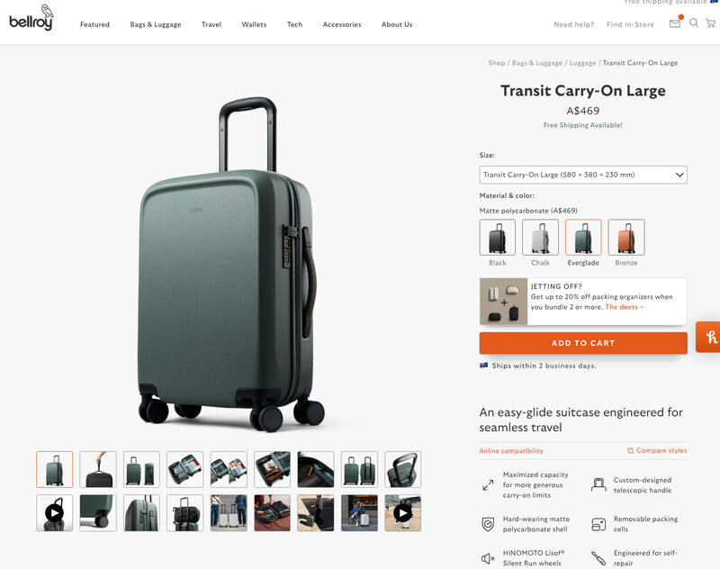
Figure 7
Bellroy has done a great job of accommodating consumer questions with...
- Video content showing the bag's durability and high design standards.
- "Airline Compatibility". Consumers want to know if this "carry on" bag complies with multiple airlines (see Figure 8 below).
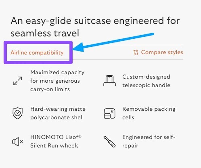
Figure 8
The final two points to note about this retailer are that this content is easy to engage with on mobile screens, and ALL of Bellroy's product page content is to the same standard, with most of their products being below $300 USD.
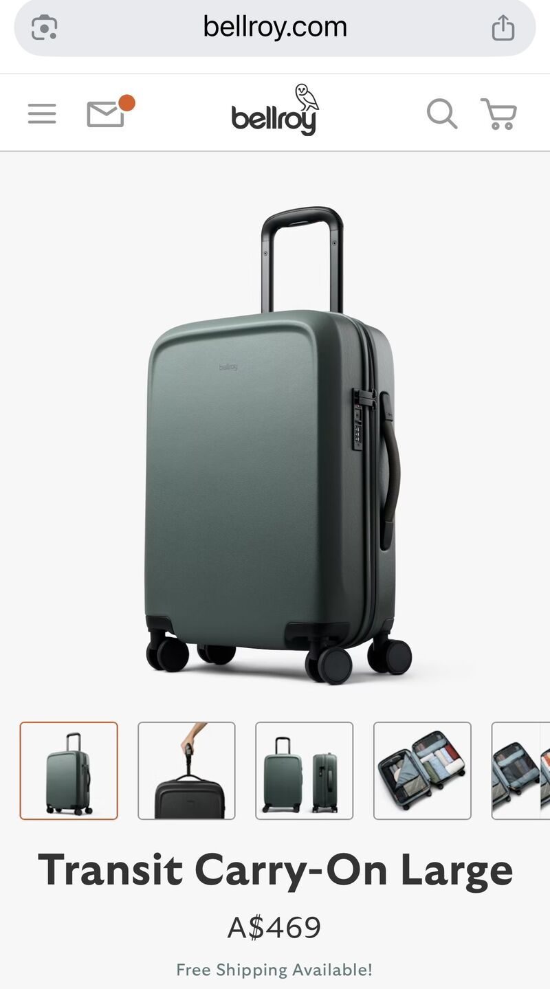
Figure 9
#4. Confidence Building is Beautiful:
Confidence converts!
The three C's above contribute to building consumer confidence, but this specific "C" takes confidence-building to another level.
This is...
- Customer-centric business policies, such as returns policies, product guarantees, and warranty clarity
- Shipping transparency, delivery timeline promises
- Customer support and employee accessibility
Each of the above also situates the evolution of a consumer from early to late-stage buying. Why? Because another term for building confidence is reducing or eliminating consumer risk.
#1. Customer Centric Policies:
Return policies and warranty clarity are not operational details; they are conversion drivers.
Customers always evaluate risk before making a purchase. Especially online.
A beautiful policy framework:
- Is easy to find
- Is written in plain language - easy to understand
- Clearly outlines costs and timelines
- Reduces perceived penalty for returns
When policies are hidden, ambiguous, or restrictive, confidence never grows, creating hesitation to buy. Retailers who view policies as legal necessities miss their commercial potential.
Reassurance is beautiful.
Zappos Example:

Zappos, a US-Based online-only shoe retailer, quickly became famous and popular with consumers purely because of its ind industry-leading returns policy.
Zappos recognised early on that the biggest barrier to buying shoes online is the fear that they won't fit. They designed their return policy to eliminate that fear entirely.
Why the Zappos Return Policy is Beautiful:
- 365-Day Return Window: Customers have a full year to return items.
- Free Return Shipping: Zappos provides prepaid UPS shipping labels, meaning returns cost the customer nothing.
- No Minimums or Exceptions: The policy applies to almost everything on the site.
- Easy Repackaging: The shipping boxes are designed to be easily reused for returns.
- Fast Refunds: Returns are often processed within 5-10 business days.
#2. Shipping Costs and Delivery Timelines:
Proactively communicating shipping costs and delivery timelines is a big confidence builder. Look at it this way: a consumer is about to give you money without receiving anything in return other than an email with a list of promises.
If this is the first time a consumer has purchased from you, the risks and anxiety are high. How will this person know they will receive the product they ordered?
The ability to create content that reassures consumers they will receive their product on time and at a specific price is crucial.
#3. Customer Support and Employee Accessibility:
How does confidence grow when a consumer has a bad experience engaging with a chatbot that does not answer his/her questions via a live chat tool?
Retailers think they are reducing their operational costs and preparing their business for scale. However, when these experiences are poor, it has the opposite effect.
Customer support and the ability for consumers to interact with an employee are immediate confidence builders and should also be considered a sales tool, not a business cost.
Confidence removes doubt. Removing doubt is one of the most powerful conversion levers in digital commerce.
Warby Parker Example:

Warby Parker's live chat is managed by employees. This direct-to-consumer prescription glasses brand is recognised for its excellent customer support, ensuring it meets customers wherever they prefer to chat.
While many companies push customers toward chat AI bots, Warby Parker uses live chat to connect customers with real people to answer questions about frame styles, prescription information, and order tracking.
Beauty Builds Trust:
Trust is the invisible framework behind every online transaction. Without it, aesthetics are irrelevant.
None of the things mentioned above should feel like add-ons. They need to be embedded seamlessly throughout the entire end-to-end customer journey.
When trust signals are present at key decision moments — especially on mobile — customers move forward with confidence.
The Cost of Getting Beautiful Wrong
When businesses prioritise visual impact over commercial performance, several things happen:
- Design budgets are consumed without measurable return
- Internal teams debate aesthetics instead of outcomes
- Customers experience friction
- Conversion rates plateau or drop
A website can look impressive in a board presentation and still underperform in market conditions. Consumers do not reward design effort; they reward ease.
The most successful online retailers do not chase beauty. They engineer it.
When a digital experience is effortless for consumers to understand, evaluate and purchase — that is beauty.
Not because it looks good. But because it works for them.
This article was as tagged as Best Practice , Digital Strategy , eCommerce Consulting , UX Design