
Every year I am asked by the Power Retail team to conduct experience design audits on large Australian retailers. This "Road Test", as they call it, is meant to show other retailers that just because these retailers are large and well-known does not imply they are delivering amazing online experiences to consumers.
This article conducts a high level experience design audit on Myer Department Store and calls out the issues and provides tips on how to make the right changes.
Smartphone Screens:
This entire audit is looking solely at experiences on smartphone phones. This is done intentionally to show how easy it is to neglect this screen-type and the potential impacts this can bring.
Due to the screen being smaller, the absence of the mouse (replaced by fingers) and the lack of navigational accessibility (the main navigation is hidden), engaging on these small screens is harder for consumers.
This means retailers must work harder to create intuitive and engaging experiences.
Other road tests have recently been conducted by Greg Randall on the following retailers....
Myer Department Store - road test:
Myer's Homepage:
The header is clean with the primary elements displayed; however, this retailer would benefit by introducing a “Store” element to prompt store locator experiences.
The feature banner is strong and in a good position, but the banner itself does not have a strong call to action to prompt behaviour. See Figure 1.
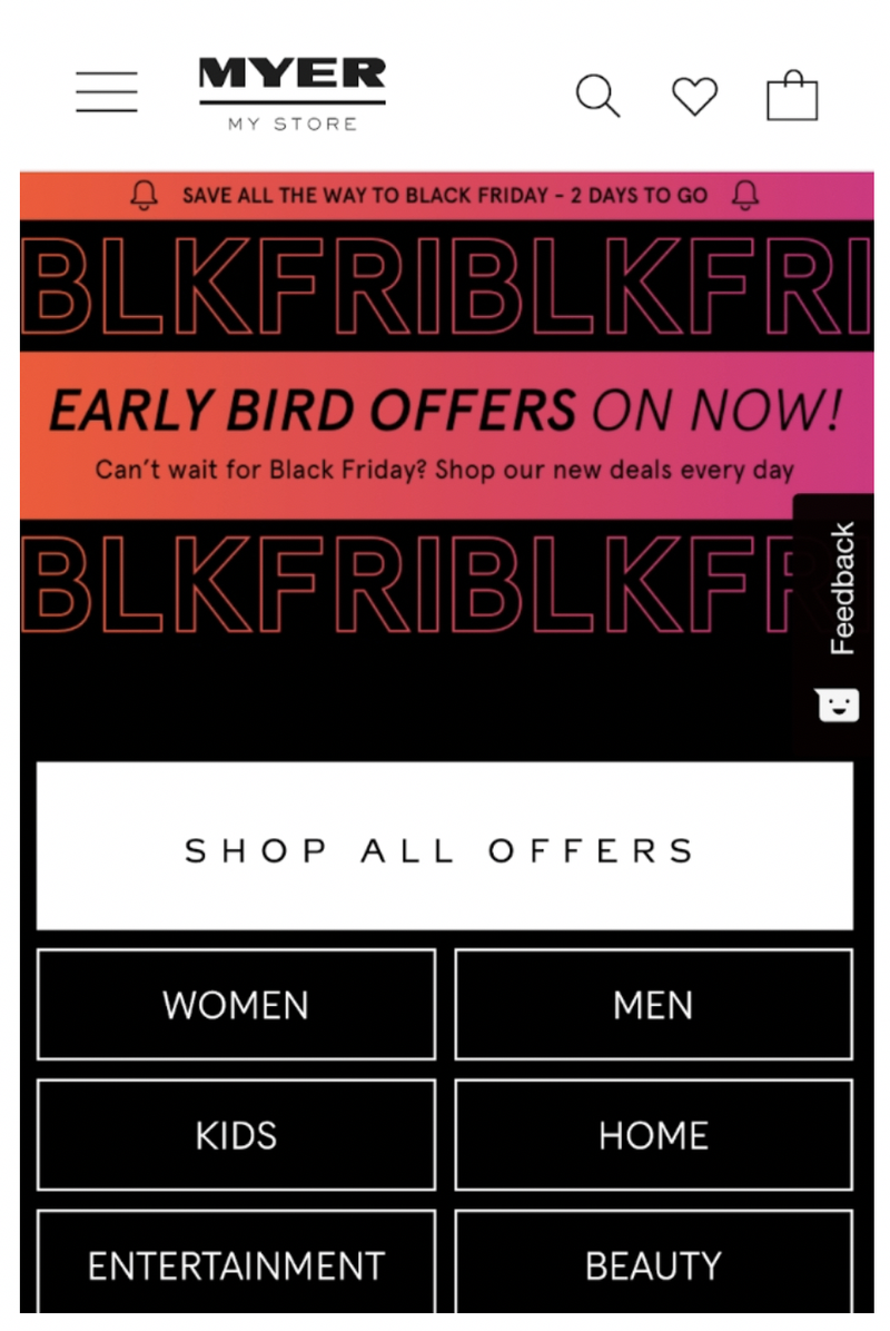
Figure 1
Below this content is a list of category specific offers which are presented to a low standard. The image and the “25% off selected women’s clothing” (for example) are not visually connected making it hard for consumers to understand they are together.
Combined with this is there being no visual cues to suggest there are clickable elements to drive the behaviour of consumers engaging with this content. See Figure 2.
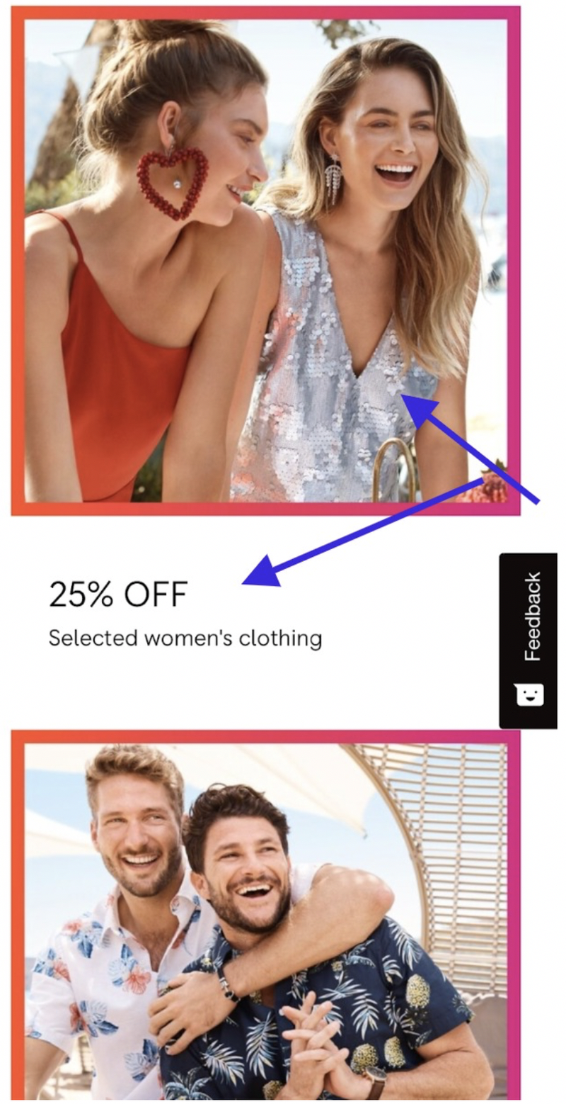
Figure 2
Below this content is a section titled “Picked for you” with a selection of Barbie products (see Figure 3).
I have never personally purchased Barbie products nor have I viewed dolls or toys on the Myer site, so it’s a puzzle as to why these products have been selected as something relevant.
This type of irrelevant product presentation jeopardises credibility.
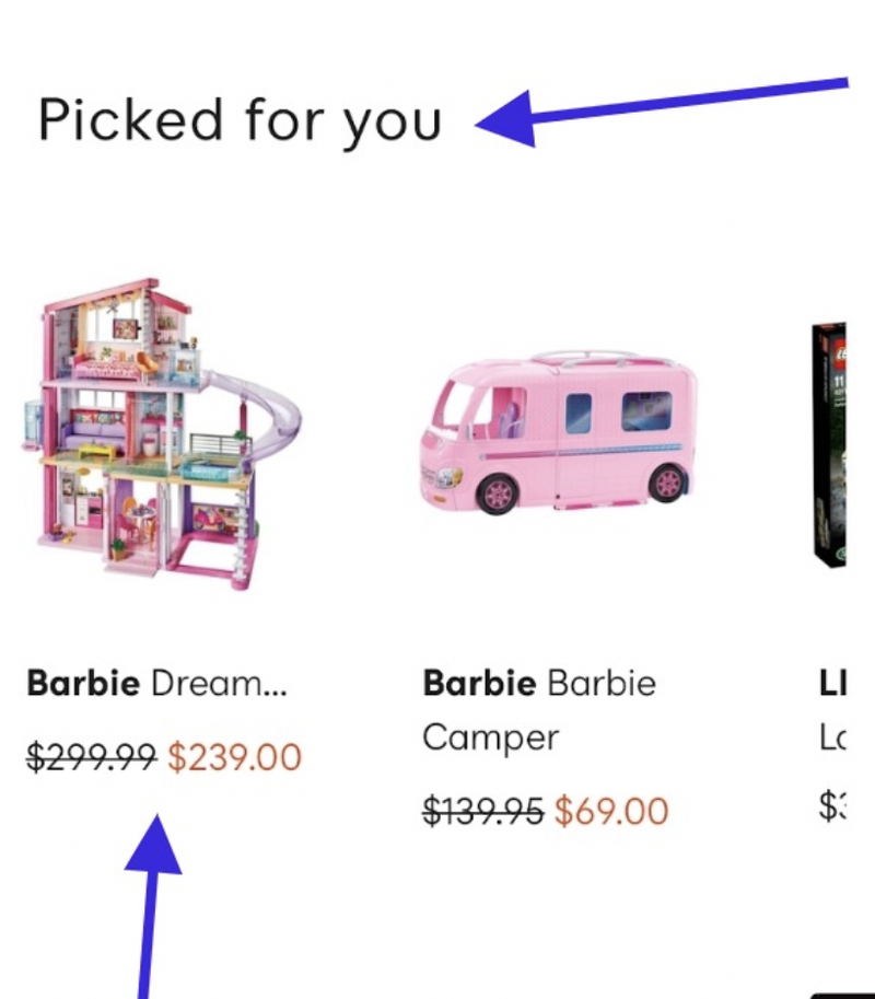
Figure 3
Site Search Experiences:
The magnifying glass icon is visually strong in the header (see Figure 1), but to prompt search experiences, the best practice treatment is to permanently display the site search box with content: “What you are looking for….”
The big issue for a retailer of this size who carries a wide range of products comes in the form of the site search logic: it does not prioritise category suggestions when consumers begin typing terms in the search box.
In Figure 4, when the consumer types “cleanser”, at the bottom of the screen, they can see “Cleanser in Beauty” as one of the options. Because the "Cleanser" category (in Beauty) is been created and designed for consumers with this specific need, it’s the ideal place to send consumer’s searching for “cleanser” products, meaning, this search recommendation should be at the top of the search listings.
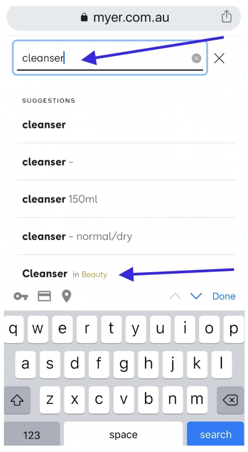
Figure 4
Main Category pages:
The ideal treatment of these category pages is to introduce relevant sub category options as seen in the Women’s Dress category.
This top half of the page is good. Nice clean images with strong sub category titles that are underlined, making it obvious to consumers these are clickable elements.
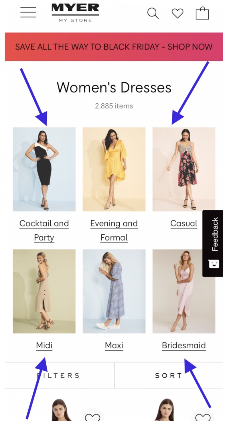
Figure 5
There is no need to show the 2,885 products below this content (which is what's happening), no consumer is going to work through 2,885 dresses on a smartphone.
Myers want consumers to quickly move to deeper more relevant sub ranges which is why the sub category visual content at the top of the page is the priority at this stage of the journey.
This retailer would benefit by eliminating the product presentation on main categories for the following reasons...
- It will quicken pageload speeds for these pages
- It will force consumers to take an intuitive step to reduce their selection
Learn more about best practice main category pages by clicking here!
Sub Category pages:
The filter and sort elements are in a good position but for larger sub categories such as the one seen in Figure 6, Myer wants to prompt refinement and/or sorting behaviours. Research proves when consumers engage with refinement elements, they purchase more than those who don’t.
These elements should have visual cues to prompt behaviour, for example underline these elements.
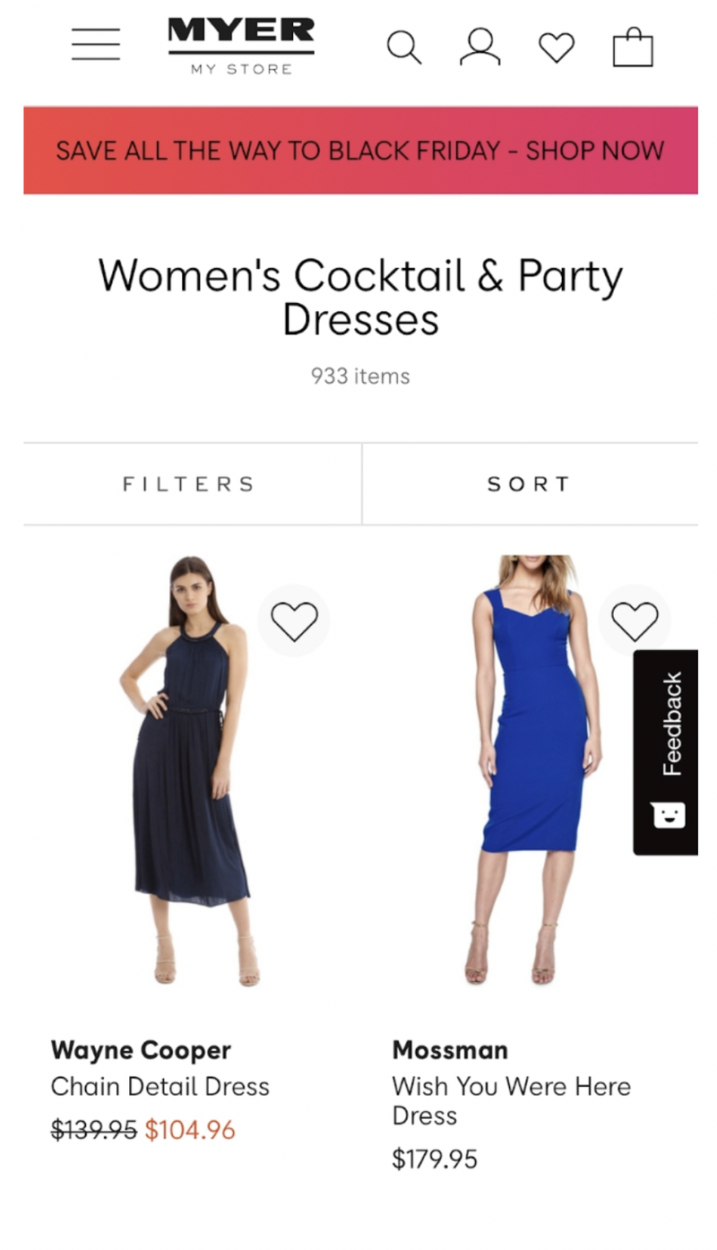
Figure 6
“Filter” is a technical term used by developers. When a consumer walks into a store they don’t say they want to “filter” their options. This term should be replaced with “Shop by” to make it more aligned to how consumers think when refining their selection.
The other issue with the sub category pages is the absence of star ratings. There are products on these pages that have customer reviews, but the star rating is not presented at the sub category level. Research proves, the presence of star ratings assist with product selection behaviour.
Learn more about best practice sub category pages by clicking here.
Product Detail Page:
When consumers land on a product page, one of the first elements which should be positioned at the top of the page is the product title. This serves as a form of validation the consumer is looking at the right product. On smartphone screens, this form of validation is important.
The “Feedback” element is too close to the “arrow” icon and will result in the incorrect selection (known as “fat finger selection”).
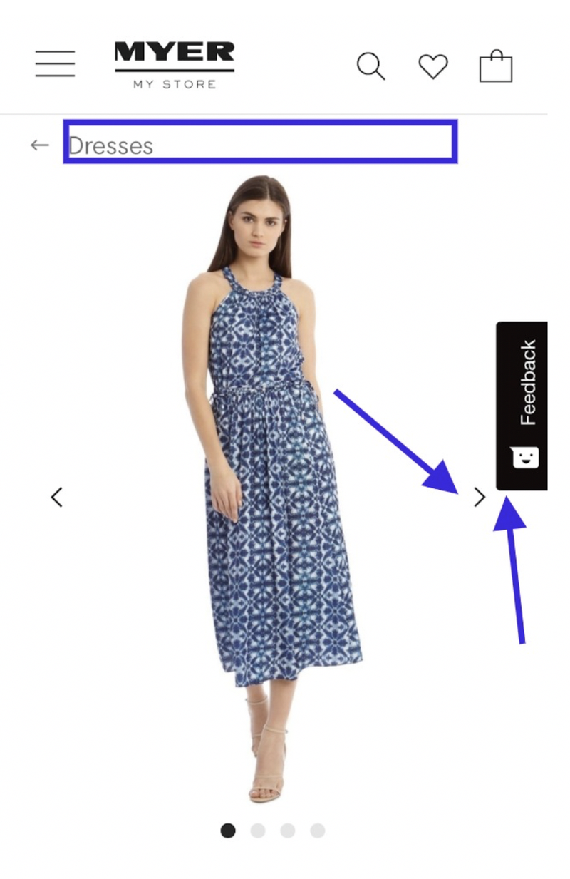
Figure 7
When products are on sale, consumers respond to “You Save” and “Percentage off”. This is an old-school retail tactic which makes the savings obvious.
Research has proven presenting both makes impact because in some instances a percentage may be low, but the savings could be high. Consumers react to whatever is larger. Myer has nothing like this displayed at the product detail page level: see Figure 8 below.
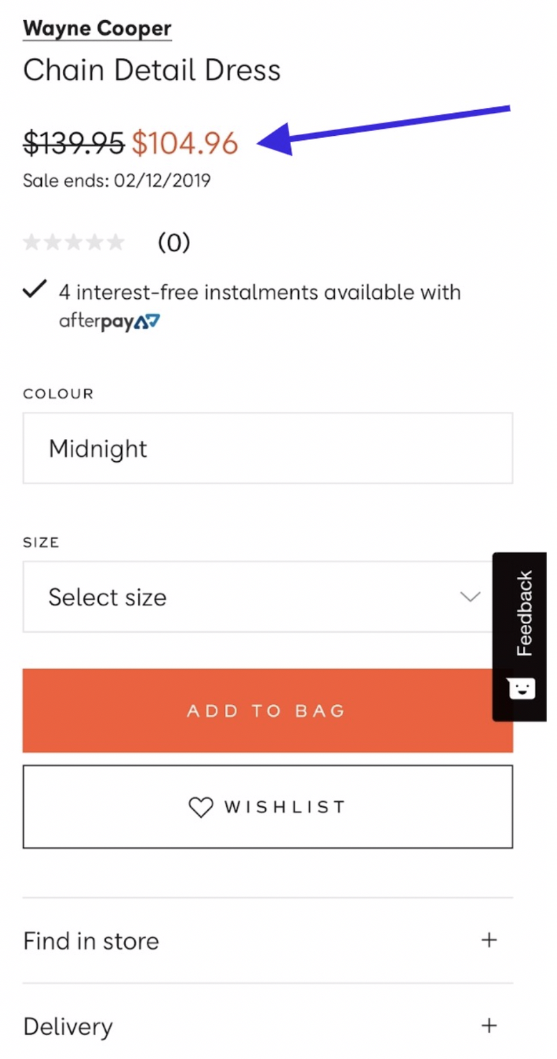
Figure 8
For all garment products, the “size guide” element is missing. The best practice placement of this element is to site directly above the “Select size” dropdown because it is at this moment, the size guide content becomes meaningful to the consumer.
As can be seen by Figure 8 above, this sizing element is not present.
For a retailer who carries multiple brands with multiple sizing scenarios, this content is critical. This one change would impact conversion rates.
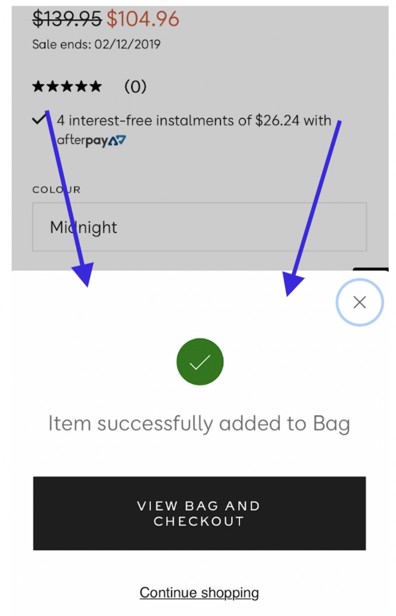
Figure 9
As can be seen in Figure 9 (above), once a consumer adds an item to the cart, they receive good validation, and obvious prompts to either checkout or continue shopping.
To learn more about the best practice product detail page, click here.
Smartphone Checkout:
Cart – Step 1:
When looking at the first step of the checkout in Figure 10, above the header is an element featuring an “easy returns” statement. This is a great message to feature at this stage of the journey, however, its placement is not ideal.
There are three issues...
- It's position at the top of the page
- Having this content reside within the brand colour scheme
- Being white font in a black background
All combine to increase the risk of this message being missed.
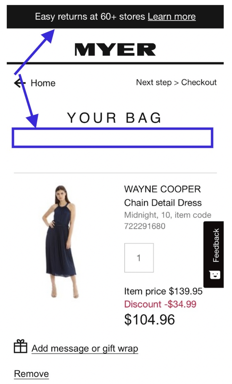
Figure 10
The consumer’s eyes are focused in the body of the page and gravitates towards the visual content: the product thumbnail. The human brain is wired to respond to visual content, and because this is the first step in the checkout, the consumer is looking for visual validation that the products added to cart are present here.
The ideal position of this returns content would be below the “Your Bag” title (see Figure 10).
Myer’s checkout has no progress bar, a crucial visual element to assist in expectation setting for smartphone checkout experiences. Consumer’s hate filling out forms and want to know how much effort is involved before proceeding.
Below the coupon code field, Myer forces the consumer to select the delivery/pick up option (see Figure 11 below). This is premature and should not be done at the cart stage. This selection is best done in the dedicated “Delivery Option” step.
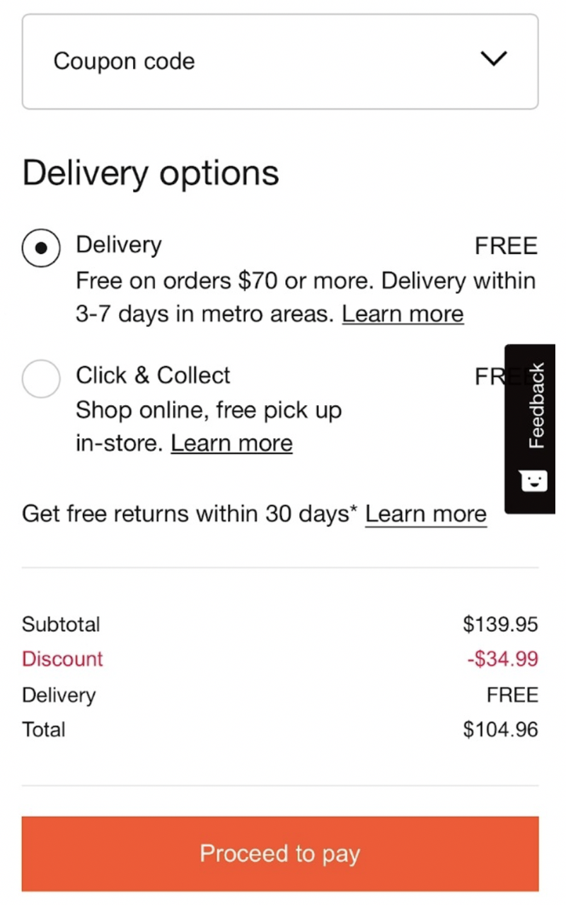
Figure 11
With the high volume of bailouts that occur in the cart step, it's crucial to keep it simple and usher the consumer on to the next step.
It would be better to display delivery options and costs as shown in Figure 11, but take away the radial buttons and have this content reside below the call to action button so those who are not interested in delivery options can easily get to the next step.
“Proceed to pay” is the wrong call to action at this stage of the checkout experience. The next step is not the payment step. This incorrect use of the call to action will confuse many and cause bailouts. The ideal call to action is something as simple as “Proceed” (or “Proceed to next step”).
Sign In – Step 2:
The “Sign In” step has no messaging on how to create an account or what happens if they checkout as a guest. Can a customer create an account at the end of the checkout?
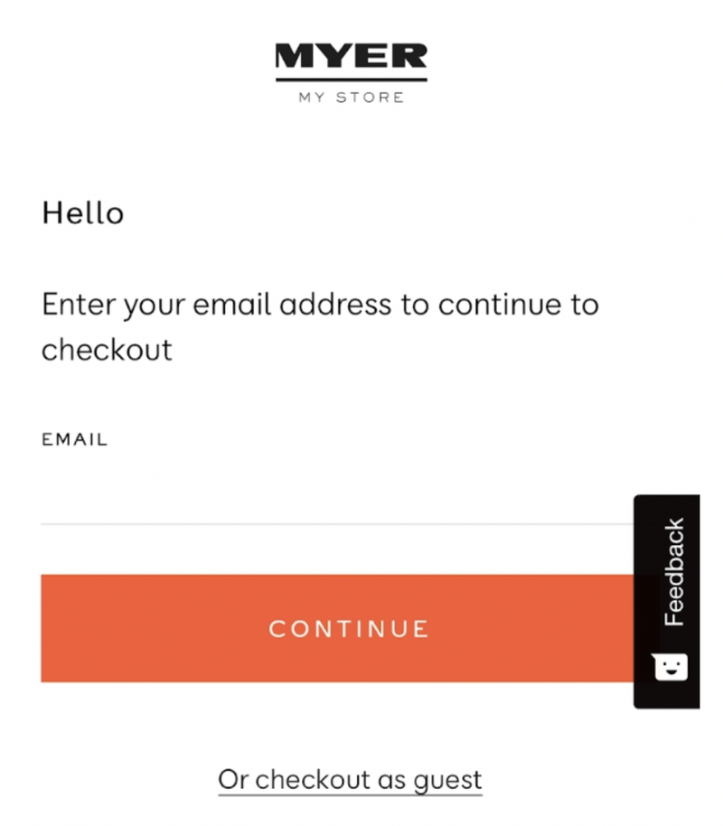
Figure 12
Many retailers think making sign in steps simple is a good thing. And in fact this is true, however, if the page is so simple where it lacks the information to assist a consumer in deciding what to do next, it does more harm than good.
The Myer sign in page is an example of not having enough information for consumers.
Delivery – Step 3:
The Delivery step asks the consumer a second time to pick their delivery option. The first time this occurred was on the cart step. This is introducing unnecessary effort and will frustrate consumers.
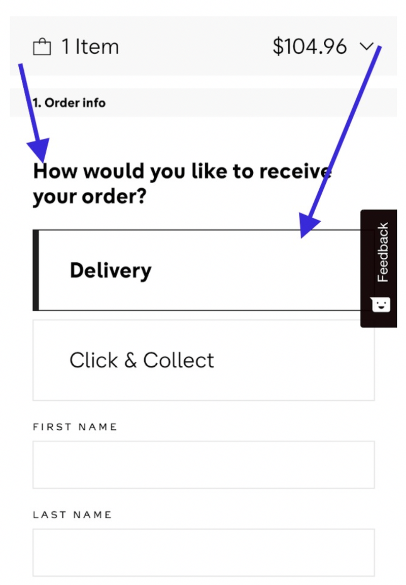
Figure 13
The selection of either “Delivery” or “Click and Collect” is also not obvious. There should be radial buttons or some form of “finger target” to prompt selection. A simple border around the selected element is not obvious enough on small screens.
Once the consumer is finished entering their delivery details, they are presented with what’s shown in Figure 14 below. Consumers are forced to click on the “Check delivery options” button.
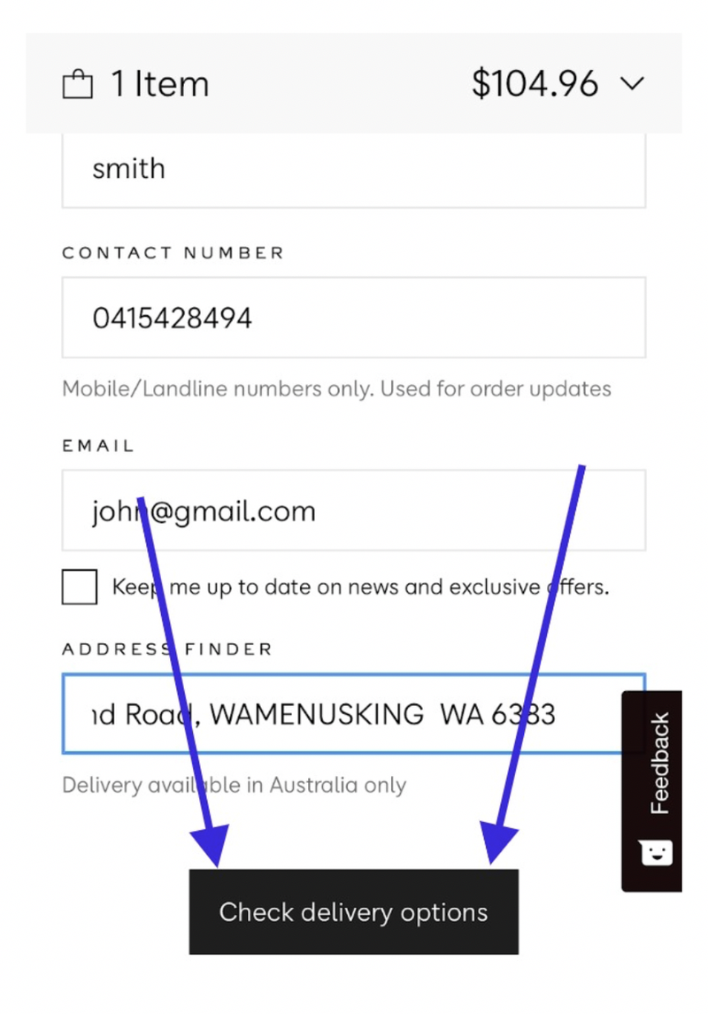
Figure 14
If the customer must view options, why not just present the options?! Why force a consumer to execute this unnecessary effort?
Once this button is pressed, it displays freight costs and time of arrival. This is good information to automatically present once the address has been verified.
The reason why this button is presented is because the technology needs to review the address before presenting delivery options. A more intuitive way to handle this technical need is, instead of having a button which says "Check Delivery options" it should change to say "Confirm Address details". This would then give the consumer confidence their informaiotn is being captured and the delivery options would then immediately display.
Only once this button is pressed a “Continue to payment” button displays which enables the consumer to move on to the final payment step.
For Myer, the payment step is broken into two steps.
Payment – Step 4:
When the consumer lands on the payment page, they are presented with three different payment options. Each time a payment option is selected, the call to action at the bottom of the page changes (see the bottom of Figure 15 below).
Due to the poor layout of this page, the proximity between selecting the payment option and the call to action is too far apart.
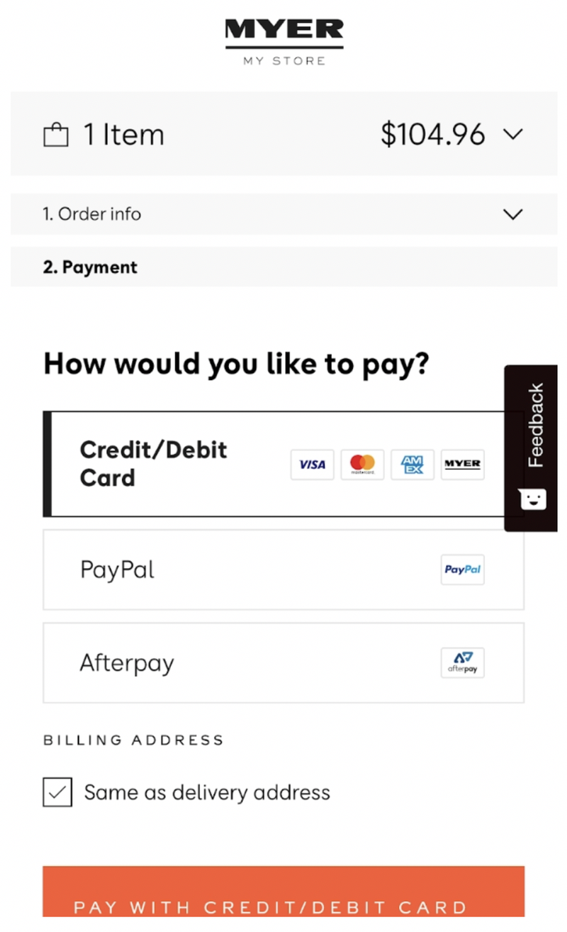
Figure 15
To fix this requires the call to action to display immediately below the selected payment option. This is ideal because his/her eye is near the payment option. To have a button display near where their eye is fixated makes next steps obvious.
Below the payment options is a “Billing Address” question which should be placed below the delivery information on the previous step.
Once the consumer verifies the payment option, and selects “Pay with credit/debit card” they are presented with what’s shown in Figure 16.
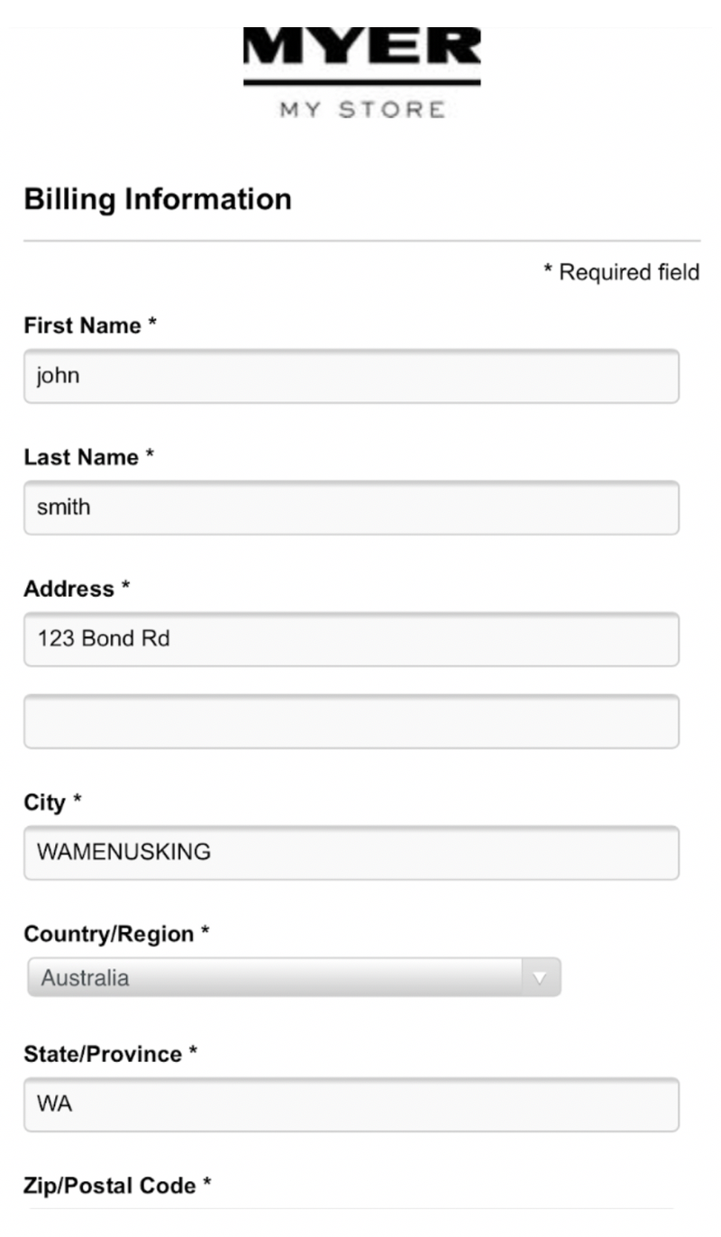
Figure 16
The consumer is expecting to see credit card payment fields. The other issue is, during the previous (delivery) step the consumer was asked to confirm the billing address is the same as the delivery address, so why is there a need to present this information?
Only once the consumer scrolls down the page beyond the billing fields do they see the credit card fields (see Figure 17).
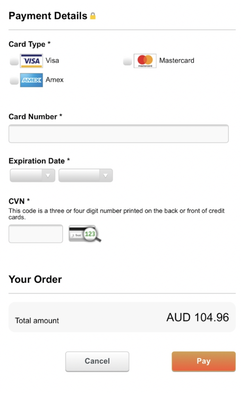
Figure 17
The most important call to action (“Pay”) is small and pushed down the page resulting in no visual strength.
This crucial action element needs to…
- Be large and visually obvious
- Be presented directly below the “CVN” field
- Comprise “Safe and secure shopping” messages
- Have security logos sitting directly below to provide further confidence
And, the “Cancel” button should not be visible at this step! It should be removed. Why introduce an option to cancel a sale right at the last moment of purchase.
Having a "Cancel" button on the payment page is like Myer having signs at their tills (in their stores) that say "It's OK if you don't want to buy the product in your hands. Just leave it at the counter and walk away". If that sounds ridiculous, you are right! The "Cancel" button is the digital equivalent.
Looking to enhance your experience design? Seek out a customer experience design specialist.
Benefits of working with an eCommerce Expert = Results:
When you work with an eCommerce Expert like Greg from Comma Consulting, these are the types of results you can expect...
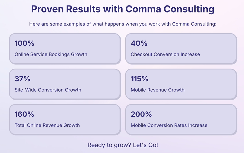
Ready to grow? Let's Go! Click here to contact Comma Consulting now.
This article was as tagged as Best Practice , eCommerce Consulting , UX Design