The Checkout Progress Bar is a functional element that is a psychological device designed to keep people glued to a retailer's checkout experience.
When done right, the research proves this functional element can reduce the high bailouts seen globally in online retail, which averages around the 70% range. This means that of the 100 consumers who initiate a checkout process, only 30 will complete a transaction. This is extremely low, and if done correctly, checkouts should be converting in the 50% range.
Progress Bar
Figure 1 (below) illustrates a best practice progress bar on a desktop screen, and Figure 2 shows the mobile version.
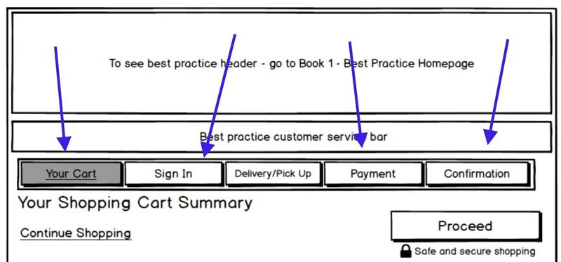
Figure 1
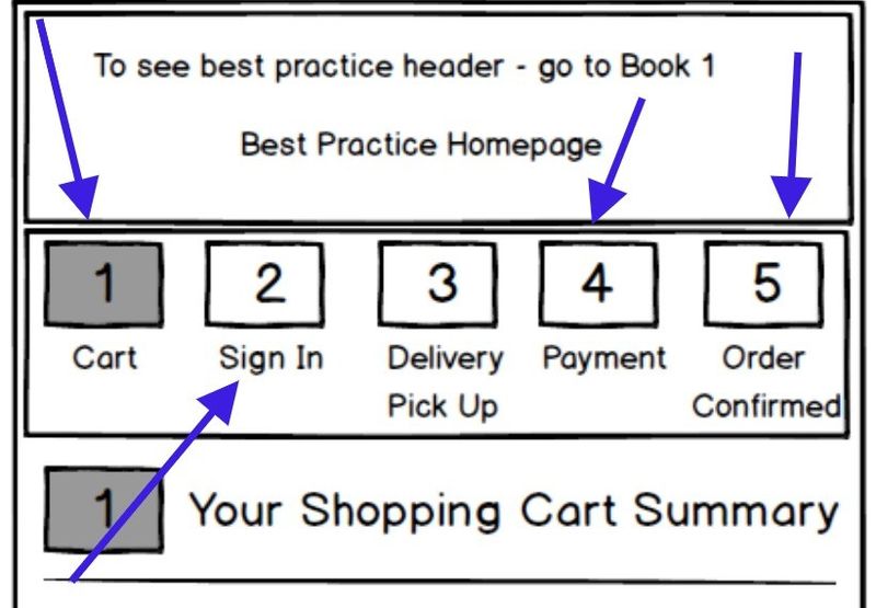
Figure 2
This functional element locks people into the checkout flow in 5 ways...
#1. Sets Expectation:
When consumers are about to embark on a checkout experience, they want to understand the effort required. This comes back to consumers wanting to be in control of their journey.
By understanding what is coming (in the form of the number of steps), the consumer will decide whether they will continue.
The lack of a progress bar increases a consumer’s risk because they are unsure what’s ahead. Is it two steps or ten? And since consumers are risk-averse, the likelihood of them leaving the checkout without this expectation-setting system is high.
#2. Psychological representation of progress and completing steps:
Consumers have a psychological drive to complete tasks presented to them. The progress bar serves this drive by visually representing the completion of steps as they work through the checkout flow.
The combination of needing to complete tasks and being visually rewarded when specific steps are completed motivates consumers to proceed through the checkout process.
A progress bar is similar to a to-do list, and the human brain is wired to respond to to-do lists because…
- It dampens anxiety about the chaos of life
- It provides structure, a plan that consumers can stick to – to-dos apply focus to completing whatever the task may be
- They are proof of what was achieved
- Not completing to-do lists or a defined task triggers anxiety and stress – there is a need for closure – the brain has a powerful need to finish what it starts
The last point is one of the reasons cart abandonment emails are effective.
The sense of achievement is a significant motivator.
#3. Simplifies back steps:
Research shows that consumers rarely take only forward steps in their online journeys. There are typically as many backward steps as there are forward ones. This is the same for checkout experiences.
There are two forms of backsteps in checkout journeys:
- Consumers taking a back step within the checkout experience (such as going from the Payment page back to the Delivery page)
- Consumers leaving the checkout to view more information (such as delivery or returns information), then coming back into the checkout
Both of the above behaviours are better supported with a progress bar.
#4. Convention:
Progress bar elements are used throughout the web and is something consumers are used to. Whether it be to download a large file (see Figure 4) or wait for pages to download (see Figure 5), consumers are used to “progress indicators” to set expectations.
Progress bars are a part of online life. The two examples below set expectations on wait time.
Check out progress bars set an expectation of interaction cost (the cost of effort required by a consumer to complete the checkout).
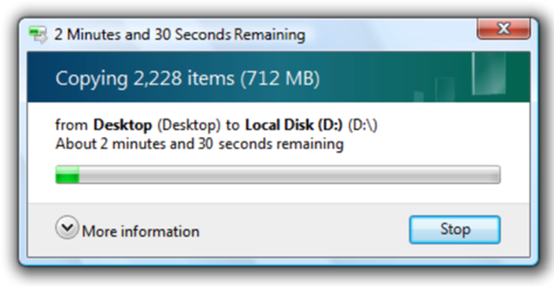
Figure 4
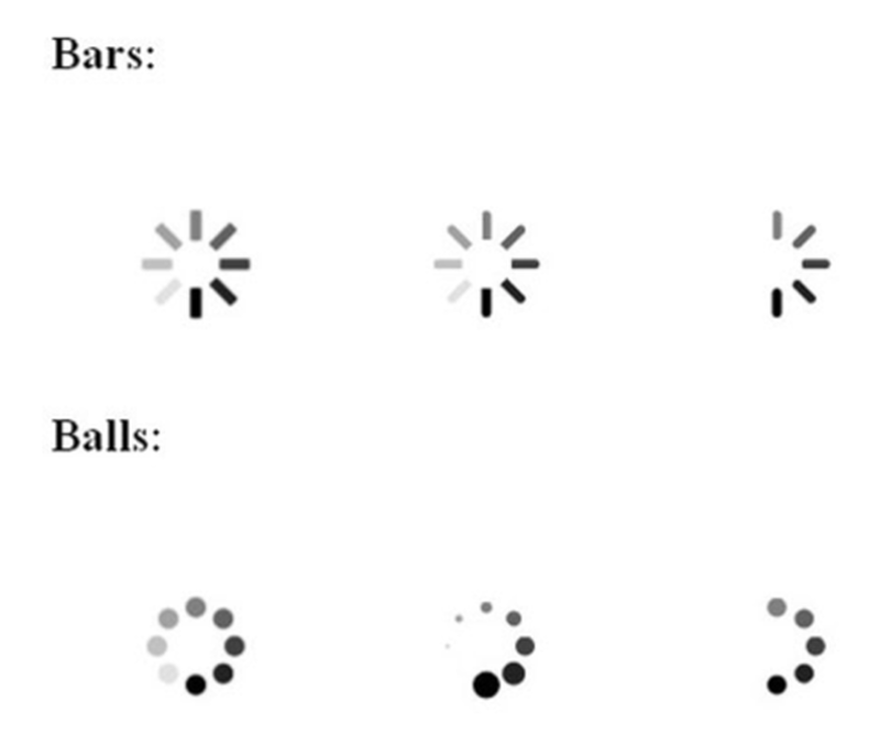
Figure 5
While progress bar treatments are conventional, checkout experiences are not. There are endless variations of checkout experiences, and while it may seem logical that taking money from a consumer can only be done in one or two ways, this is not the case.
This is what makes checkout progress bars so important.
#5. Communicating Cumbersome Tasks:
Rule #1 in simplifying complicated tasks is to apply extra effort in creating guiding visual elements to pull consumers through a process.
Consider a physical retail setting where a consumer must follow multiple steps to complete a purchase, guided by retail staff —a “human progress bar”. Checking out in store is easy because a human employee always leads and owns the "money-taking" process.
Best Practice Characteristics:
For a progress bar to achieve the above, it must comprise the following visual and behavioural characteristics (refer to Figure 6 below)…
- It must be positioned at the top of the page (located below the header). Eye-tracking studies verify this region of the page is where the eye lands first when consumers move on to new pages.
- Each step of the progress bar must display as a clickable element (once a step is completed). This is done to facilitate, support and simplify back steps.
- As the consumer progresses through the checkout, the progress bar must visually change to indicate progress. These visual changes must be clear. Not subtle.
- The titles in the progress bar must match the titles in each checkout step. This matches the progress bar to each page of the checkout.
- As a step is completed, visual validation cues inform the consumer that the system ("system" = eCommerce platform) has captured all the information needed to complete that step. This is achieved by introducing "tick" elements within the progress bar (see Figure 6).

Figure 6
Nordstrom - bad example in action:
Nordstrom may be considered a success story online, but their checkout experience is to a low standard, specifically in the context of progress bar utilisation.
This retailer has a 4-step checkout, but consumers would never know this when looking at the first step of the checkout experience (see Figure 7).
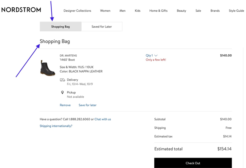
Figure 7
This experience is made worse by the purchase validation Nordstrom provides. Once the consumer adds a product to their shopping cart, they are presented with validation messaging, as shown in Figure 8 below.
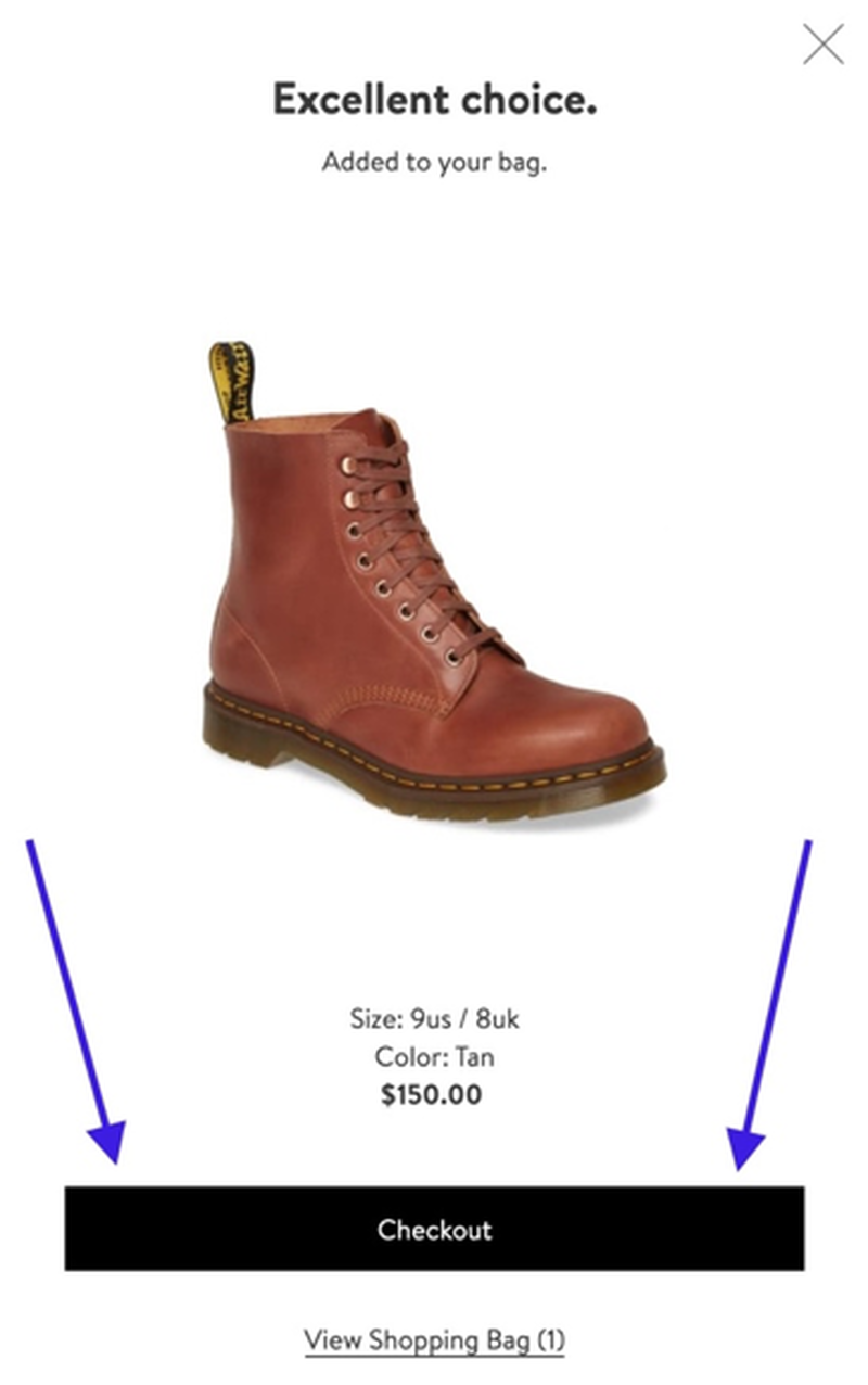
Figure 8
The primary call to action is for a consumer is to “Checkout”. However, when the consumer selects the “Checkout” button the are taken to what’s shown in Figure 9 (below)…
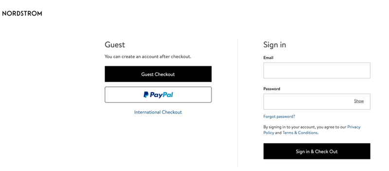
Figure 9
There is no header, no progress bar, and the consumer is taken directly to the sign-in step. For many consumers, this will be a jarring step.
- What happens if the consumer has multiple items in their cart and wants to see the total cost of the order?
- What happens if the consumer wants to see what the delivery costs will be for this order?
Nordstrom is also assuming the consumer understands what “Checkout” means vs “View Shopping Bag”.
None of these initial steps in Nordstrom’s shopping cart are helping the consumer begin an intuitive checkout experience.
Conclusion:
After reading this article, you may think you don't need a progress bar because your checkout is a One-step process. Guess what! One-step checkouts are the worst-performing checkouts in the world.
Research shows that the top-performing retailers in the world typically average five steps in their checkout process. And every eCommerce Platform has the capability to enable you to improve your checkout journey.
The first step is to work with an eCommerce Consultant to plan the checkout experience (introduce a progress bar) and then implement the change.
There is more good news! When your checkout flow aligns with the best practices defined above, you can expect substantial growth in conversion rates.
Imagine if you have 10k people leave your checkout each month, and you reduce that by 20%, which is a conservative estimate. You have just added 2k extra transactions without spending a dollar on more marketing.
Designing a best practice progress bar is an excellent example of eCommerce Conversion Rate Optimisation.
Benefits of working with an eCommerce Expert = Results:
When you work with an eCommerce Expert like Greg from Comma Consulting, these are the types of results you can expect...
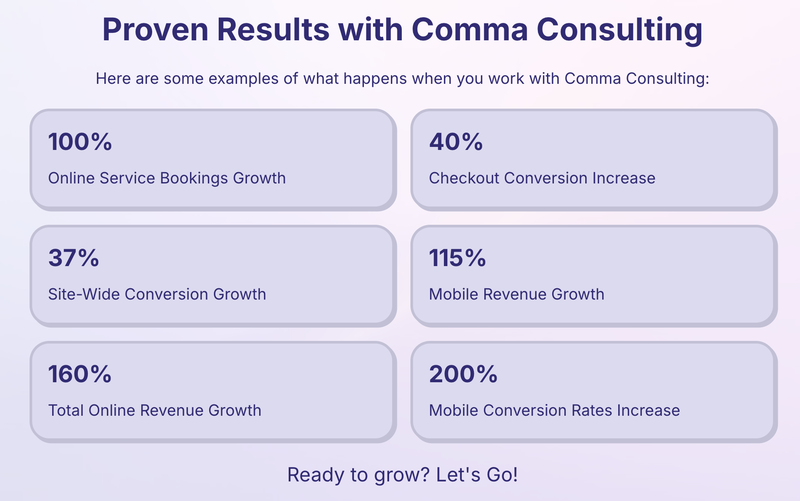
Ready to grow? Let's Go! Click here to contact Comma Consulting now.
This article was as tagged as Best Practice , eCommerce Conversion Rate Optimisation , UX Design