One of the most common fallacies in digital is, if you are a big retailer you must know what your doing. This could not be further from the truth. To illustrate this, there will be a series of upcoming articles which will conduct a deep dive into large well known retailers and providing specific examples as to why they are underperforming in the delivery of creating amazing online experiences in various contexts.
This has already started with an article written in the demise of Jeanswest (click here to read).
For Kitchen Warehouse, an audit was done on their mobile checkout.
Caveat:
Since writing and publishing this article, Kitchen Warehouse has changed their mobile checkout. However, this article is still relevant because this old checkout was live for years and causing "checkout experience chaos" for thousands of consumers.
For those reading, it's still important to see what Kitchen Warehouse did wrong and what needed to be done to rectify.
There are "mini lessons" throughout this article backed by research to prove statements being made.
The purpose of this review is not to appear to be hard on this retailer but to educate others.
Why is the checkout important to get right?
Consumers have the freedom of engaging with a retailer in anyway he/she desires. The consumer has full control of the his/her experience and the content they wish to view. However, once the consumer reaches the shopping cart, they lose all control and are now at the mercy of a “checkout” experience dictated by the retailer.
This highlights the importance of creating an elegant/intuitive checkout experience where no confusion or unnecessary effort is required to complete. And to achieve this across all screen types (desktop, tablet, mobile).
The Kitchen Warehouse checkout review is being done on the smartphone screen intentionally. Bad checkout designs can get away with a low standard of checkout experiences when it displays on larger screens.
However, bad checkout mobile designs have proven to hurt revenue performance.
Step 1 – Shopping Cart:
When consumers arrive to the first step of the checkout experience, the "Your Cart" step, they are presented with what's shown in Figure 1 below.
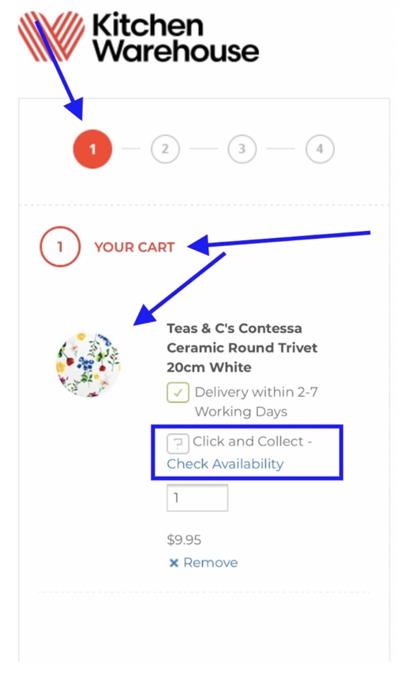
Figure 1
Some comments about Figure 1:
The progress bar is important in the checkout to articulate the volume of steps needed to complete and show progress as a consumer works through the steps. This is an important expectation setting element.
The issue here is, the steps are not labelled to assist in setting expectation of the consumer.
The other big issue is the product in the cart (in Figure 1) was on sale, and yet the sale price does not display on the checkout. This presentation of sale price is necessary to remind consumers of the savings they stand to make if they purchase the product.
Merely presenting the buy price is not enough.
Kitchen Warehouse creates confusion by offering click and collect where a certain store location has the product in stock. Consumers expect to select any product they want. It's not the consumer's problem this retailer does not have a certain product in stock at a certain location.
This business rule will create many cart bailouts.
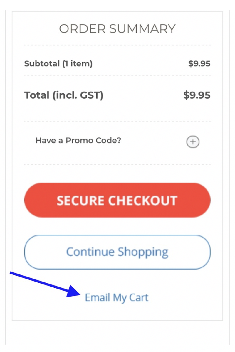
Figure 2 (showing the bottom of the first step of the checkout)
Some comments about Figure 2:
At the bottom of the cart page Kitchen Warehouse have hidden the promo code, see "Have a Promo Code?".
This visual treatment is not recommended if a retailer utilizes this element often to drive campaigns. Hiding this page element makes more work for consumers and increases the risk of it being missed.
The “Email My Cart” is a good function for those consumers who may not have time to complete the purchase but want to save the items they added to the cart.
What's Missing:
Research has proven, some of the most critical messaging needed on this first step of the checkout is the presence of security assurances: lock symbols, security logos. While Kitchen Warehouse has “Secure Checkout”, there is no other proof points to suggest this is a secure checkout process: no lock symbols and/or security logos. Presenting "Secure Checkout" is not enough and a very poor call to action.
Further to the call to action, the ideal call to action in the checkout is to set expectation that by clicking this button, the consumer will be taken to the next step: “Secure Checkout” does not achieve this. What would be better is “Proceed to Next Step”, or just “Proceed”.
Research proves another critical piece of information consumer look for in this first step are delivery costs. Kitchen Warehouse does not present any delivery costs or delivery cost expectations and will result in consumers leaving.
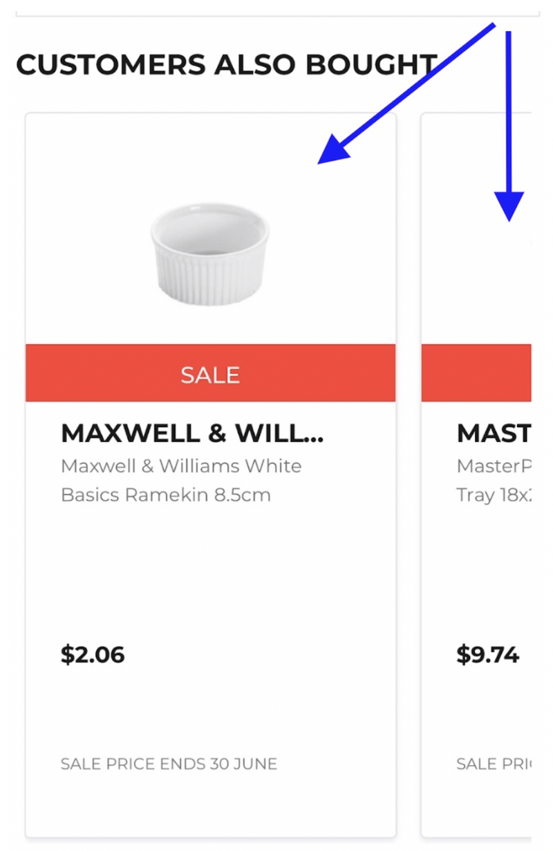
Figure 3 (bottom of first step)
At the bottom of the first step of the checkout are product recommendations. It’s not clear if a ramekin is relevant to a trivet (the product purchased), but it does not appear to be a good choice.
More importantly, the presentation of “Customers also bought” is to a low standard because it forces consumers to swipe through products. This creates unnecessary effort for the consumer.
This retailer would be better off showcasing smaller product thumbnails that remain in full view to simplify the ability for the consumer to scan these upsell options.
Step 2 – Delivery Options:
When consumers arrive to the "Delivery Options" step of the checkout, they are presented with what's shown in Figure 4 below.
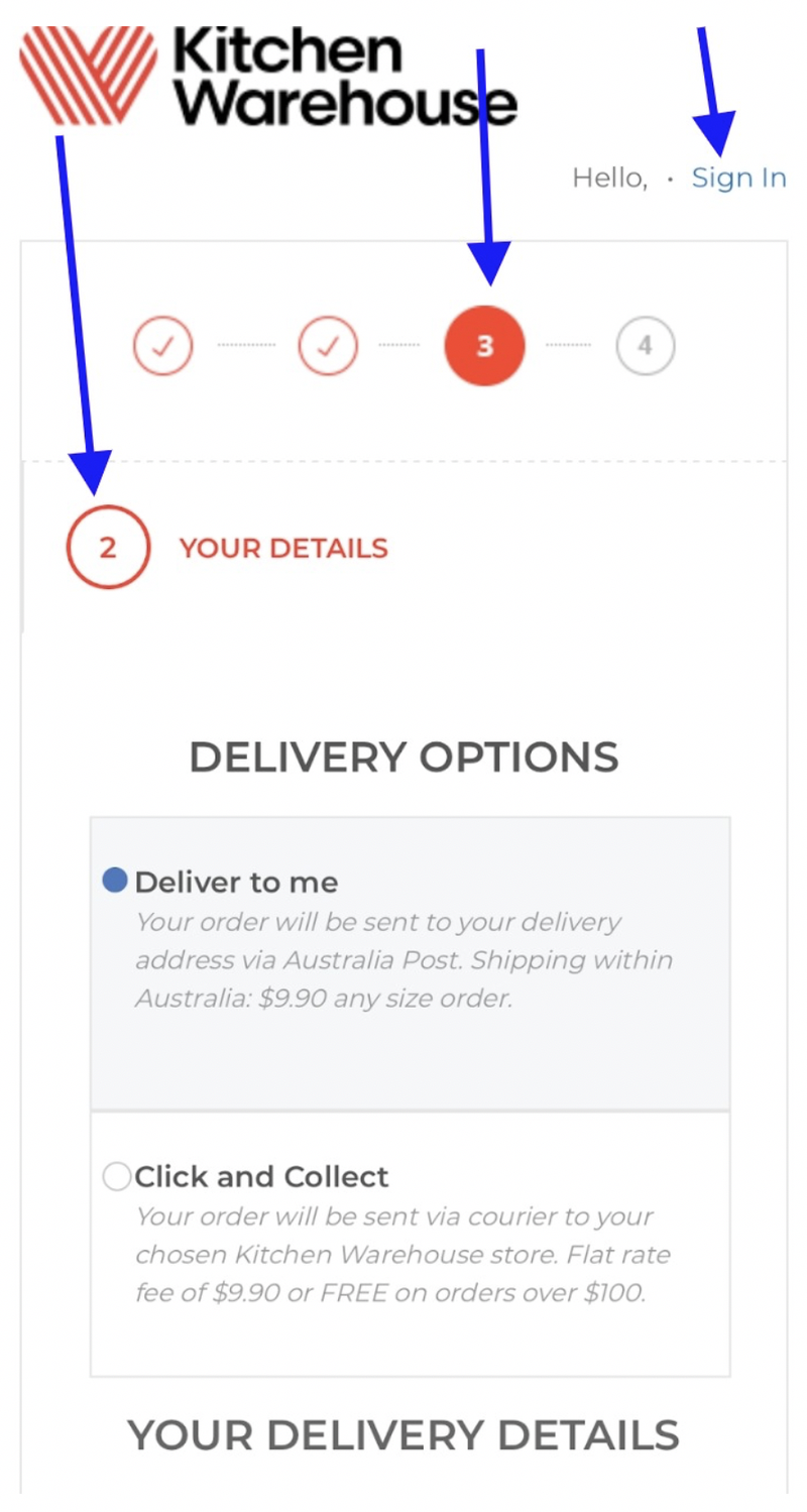
Figure 4
Comments from Figure 4:
The biggest issue found at the top of the page is with the progress bar. The consumer has only moved 1 step and is now on Step 2, but the progress bar shows the consumer is on Step 3. This will create confusion; the consumer will think he/she missed a step.
This confusion becomes greater due to the heading saying “2 Your Details”.
The delivery options at the top of the page are good: “Deliver to me” and “Click and collect”. It’s clear and simple, but there are very little prompts around making sure the consumer selects the right option. The radial buttons should be larger, and there should be a prompt below the “Delivery Options” title which says “Pick your delivery option”.
The other issue is the small “Sign In” link appearing in the top right corner. This can be easily missed.
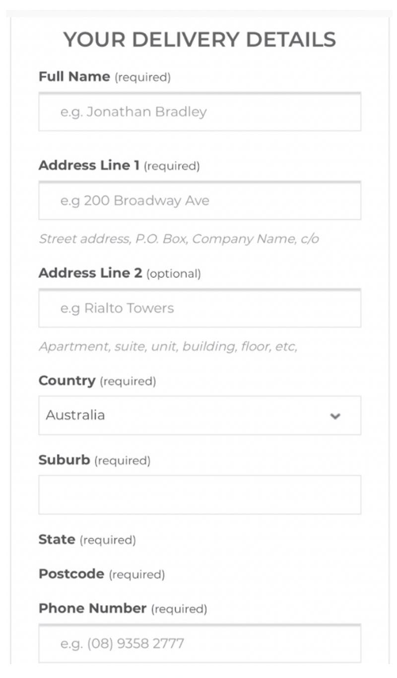
Figure 5
Comments on Figure 5:
The address fields Kitchen Warehouse require will cause confusion. They are asking for Address lines 1 and 2 and then request the consumer to re enter their "suburb" further down the page (after the "Country") field.
To the consumer this appears to request the same information twice, but in fact for Kitchen Warehouse, they are wanting the as part of the address entry.
The issue here is the ordering of the fields for the address. It should be as follows...
- Address Field #1
- Address Field #2
- Suburb
- Country
It is this unusual ordering which causes the problem. This layout gives the appearance of Kitchen Warehouse asking for the suburb when the consumer may have entered this already in the "Address 2" field, giving the perception of the retailer asking for the same information twice.
One of the worst things retailers can do is make consumers double enter information on smartphone screens.
It’s also important to note an email address is not asked at this stage which is unusual when considering this step is titled “Your Details” and is where the consumer expects to give out this information.
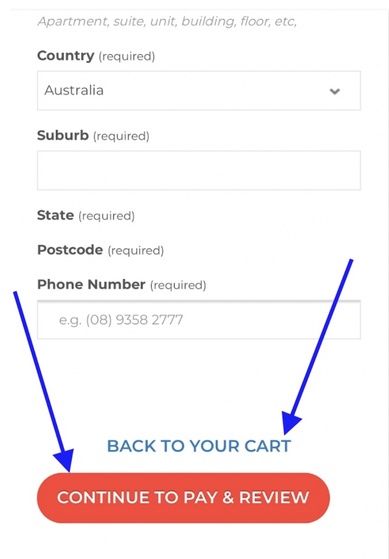
Figure 6 (bottom of the page of “Your Details” step)
Comments on Figure 6:
The “Back to your cart” hyperlink has multiple issues:
1. Kitchen Warehouse is assuming consumers know what this actually means. It should read, “Back to step 1 of the checkout” or simply “Go Back” to make more sense.
It does not look like a link and its situated too close to the “Continue to pay & review” call to action. Close proximity of links and buttons is an experience killer on smartphone screens. It increases the risk of the consumer selecting the wrong thing. This is known as “fat finger syndrome”.
2. The primary action Kitchen Warehouse wants consumers to take at this stage is to select the “Continue to Pay & Review” call to action.
Why have “Back to your cart” sitting above in the prominent position? This hyperlink should be situated below “Continue to Pay & Review”, not above. This is known as the “call to action hierarchy”.
3. When consumers select the numeric field for the phone number, the smartphone keypad does not change to the number pad to simplify the effort of entering a phone number. The dynamic adjustments of keypads to replicate the information required, is best practice because its proven to simplify input for the consumer.
4. Kitchen Warehouse offers no statement about creating an account or giving consumers information around checking out as a guest being an option. This will create confusion because normally this is the step where these options are addressed. This absence will cause bailouts, research has proven 20% of consumers look for the "checkout as a guest" option and will leave if it's not clear and obvious.
Step 3 – Pay & Review:
When consumers arrive to the "Pay & Review" step of the checkout, they are presented with what's shown in Figure 7 below.
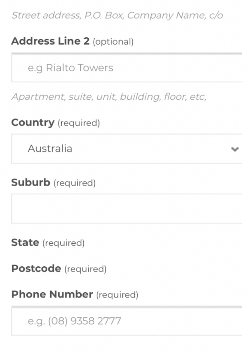
Figure 7
Comments on Figure 7:
The consumer has completed Step 2 ("Delivery Options"), she has entered all her delivery info and selected “Continue to Pay & Review” (refer to Figure 6).
To the consumer, it appears like they have not moved to another step in the checkout because they are presented with very similar "delivery" fields as seen in the previous step. It appears her information has been lost and the checkout is asking for it again.
This will create confusion.
In reality, consumers have been taken to Step 3 (Pay & Review) but they have been pushed down the page where he/she cannot see the page title and the progress bar showing they have moved on to the next step.
Consumers need to scroll up the page to see the "Pay & Review" page title, creating more unnecessary effort (see Figure 8 below). The address fields are the "Billing Address".
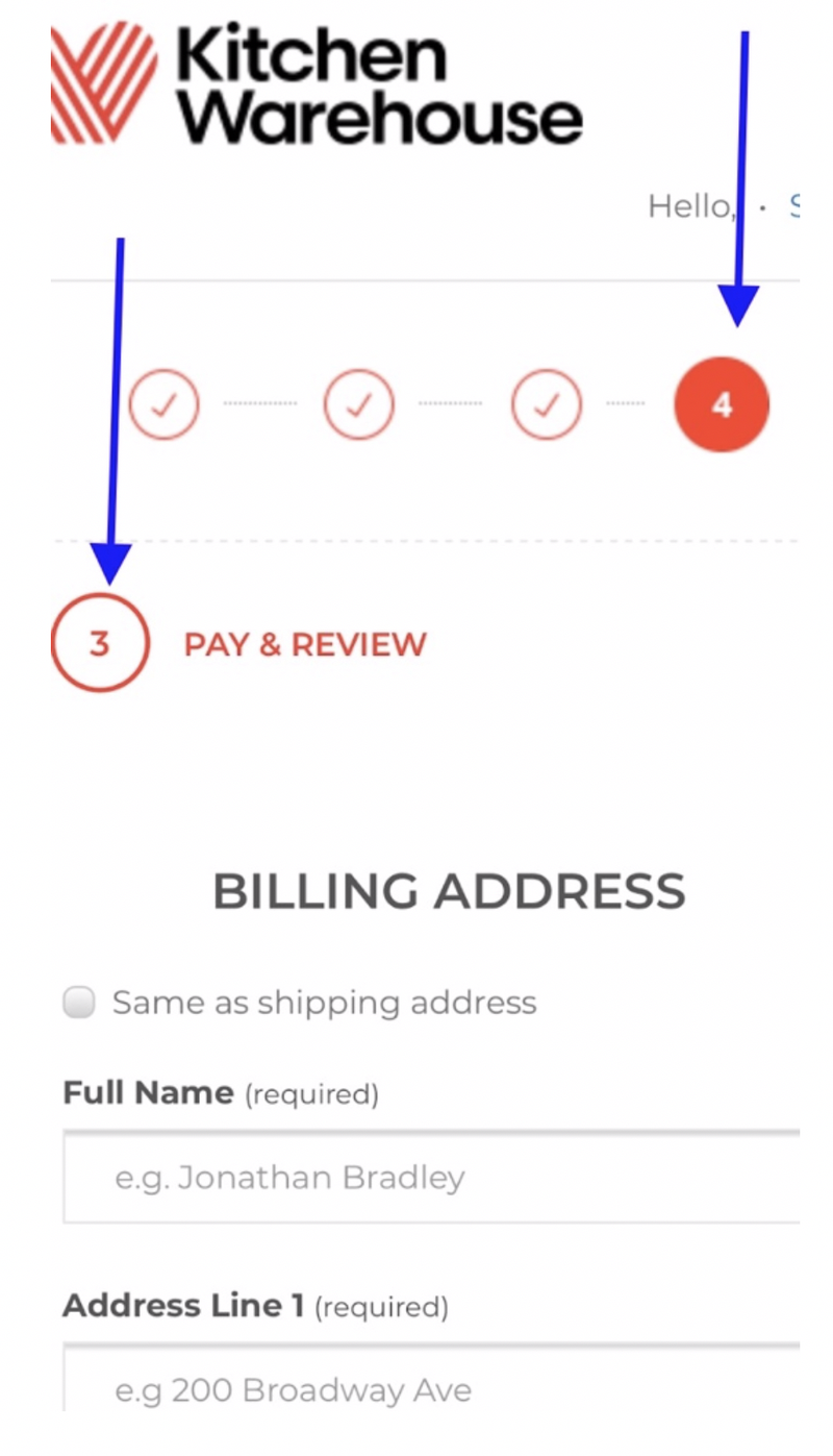
Figure 8
Comments on Figure 8:
The “Billing Address” fields should not be located at this step of the checkout. It should be included on the previous step with a simple "tick" element which states "Same as Delivery Address".
There is no clear view of payment fields near the top of this page which will create confusion because that is what consumers are expecting. They clicked a button on the previous step which says "Continue to Pay & Review"!
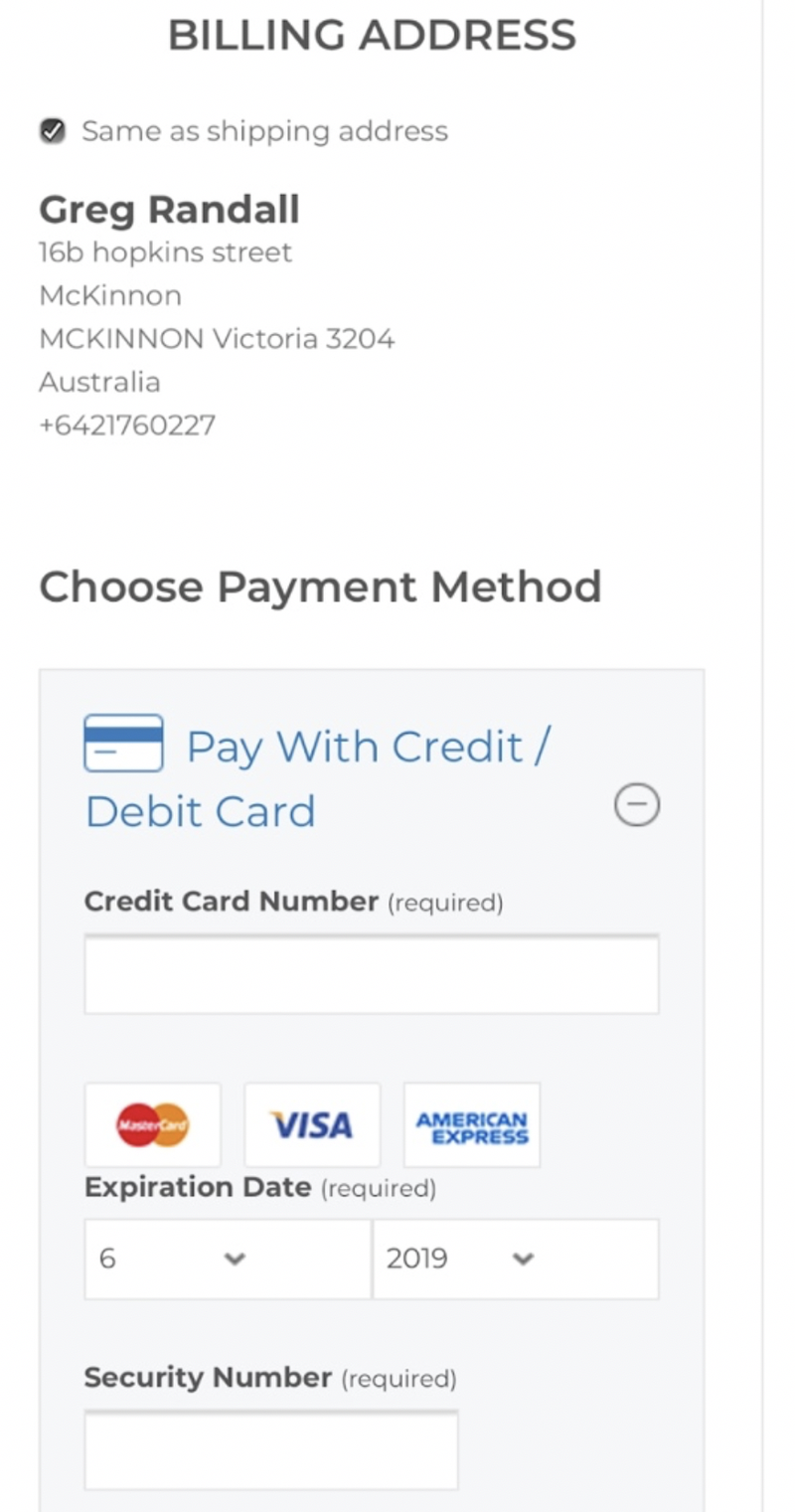
Figure 9
Comments on Figure 9:
Once the billing address is confirmed, they then see the “Choose Payment Method” title.
Standard presentation of credit card payment is seen in Figure 9. No comments good or bad on this other than it’s at the bottom of the page.
Once the consumer fills out her payment details, she is presented in what's shown in Figure 10 below.
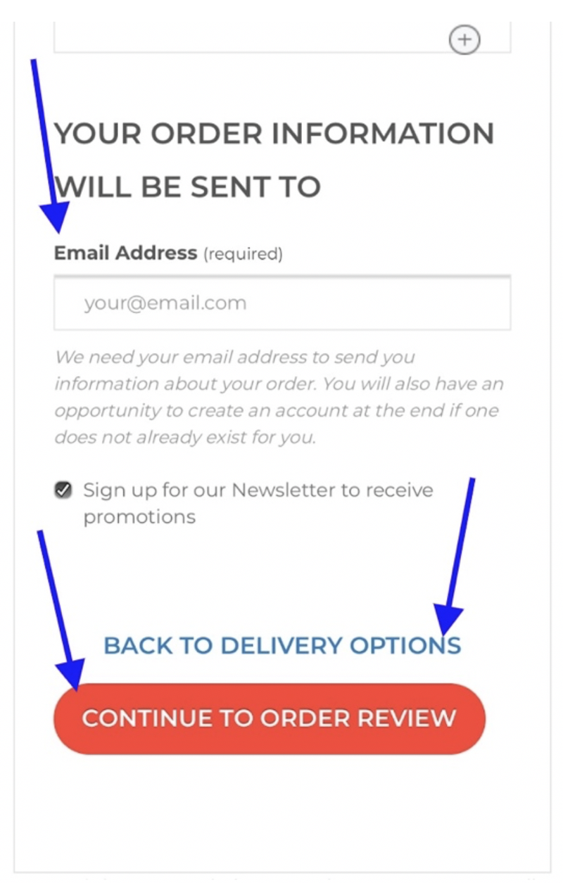
Figure 10
Comments on Figure 10:
Once the consumer enters his/her credit card information the most important next step is to prompt the consumer to confirm the order.
This is where Kitchen Warehouse has presented the email address field. As stated earlier, this should be captured in Step 2.
The issue of call to action placement discussed earlier is also evident here: "Back to delivery" should be below the primary call to action ("Continue to Order Review").
The call to action “Continue to Order Review” will also cause confusion. The consumer is currently on a step in the checkout titled “Pay & Review”. Now Kitchen Warehouse is stating the consumer needs to review the order again!
According to the progress bar, the consumer is on the last step (refer to Figure 8). By introducing another "surprise" step will cause bailouts.
Kitchen Warehouse has introduced this "surprise" step because it does not have an "Order Summary" element which allows consumers the ability to review her order at any time throughout the checkout.
This step should have a call to action saying “Confirm your order” which processes the payment.
Review Your Order:
Once the consumer selects "Continue to Order Review", they are presented with what's shown in Figure 11 below.
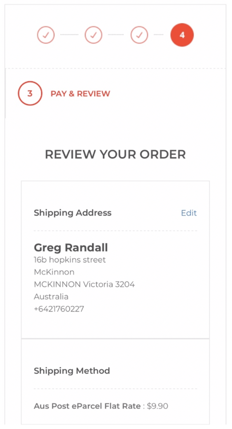
Figure 11
Comments on Figure 11:
Kitchen Warehouse should not assume every customer wants to see a review of the order. There are subtle and elegant methods to present an option to review the order, as stated above, introduce an "Order Summary" element which is closed and can be easily opened for those who want to see this information.
This is a best practice approach called "layering".
Order Confirmation - creating an account:
There is alot of debate on whether to introduce the account creation step during the checkout process or at the end of the process. There are pros and cons for each.
However, if you are going to place this at the end of the checkout, as Kitchen Warehouse has done, it needs to be visually and mechanically treated to a high standard.
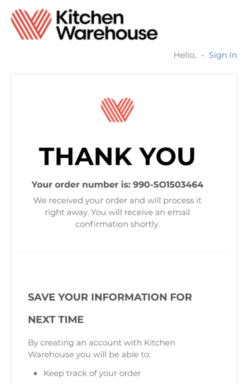
Figure 12
Comments on Figure 12:
The consumer is then presented with the order confirmation page along with prompts to create an account. There are issues with this email.
There is no confirmation as to what the customer purchased. This is an important "feel good" moment and an opportunity lost for Kitchen Warehouse to build a greater connection.
There is no call to action to prompt account creation. The copy seen in Figure 12 is visually weak and will be easily missed by most. "Save your information for next time" is in the same font as the other copy making it blend on these small screens.
Kitchen Warehouse would be better off creating a call to action button to prompt account creation. Upon clicking this button the customer can be taken to a dedicated page or at least be taken down the same page to complete the steps.
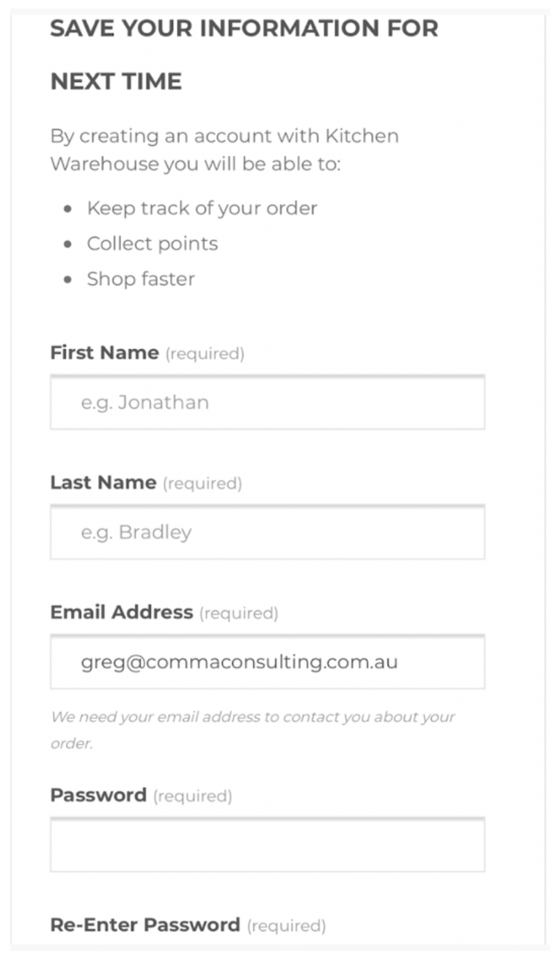
Figure 13
Comments on Figure 13:
The main issue with the create account step seen in Figure 13 is it does not remember the customer’s name which she just filled out during the checkout! Kitchen Warehouse wants to make this process as easy as possible, asking the customer to enter her details in again is unnecessary effort.
The other issue seen in Figure 14 below is, Kitchen Warehouse is asking the customer to sign up for a newsletter for a second time. Refer back to Figure 10 where this is asked the first time.
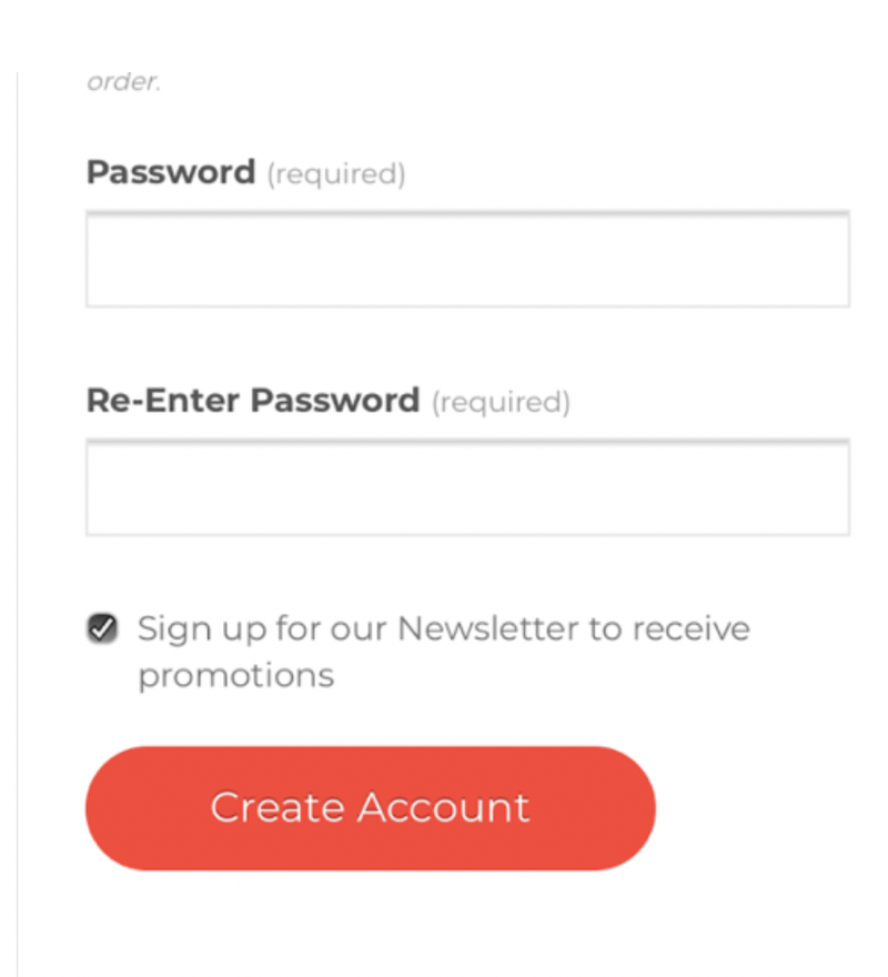
Figure 14
Conclusion:
The Kitchen Warehouse checkout process has a long list of issues, however if rectified, the improvements would conservatively increase checkout conversion rates by at least 3% to 5% ("checkout conversion rates" = those who land on the shopping cart and complete a purchase).
This may not sound like a lot but consider the following scenario, this is what we know...
- We know the typical retail checkout conversion rate is 25% (industry standard)
- We can guess the online average order value is for Kitchen Warehouse is approximately $100
- We can also guess the volume of consumers who would start the checkout process would be in the 10,000 per month range
Based on this, if the checkout conversion rate increased from 25% to 28%, the business would see the following impacts...
- An increase in 300 completed orders each month
- This would result in an extra $30k in monthly revenue
The costs to repair the shopping cart could be high, however, once its done, it will continually add business value over and over again.
ROI for an investment like this would be less than 8 weeks.
Do you think your checkout experience has issues? Do you need guidance from an authority in customer experience design and a specialist in checkout experiences?! Let's have a chat!
This article was as tagged as Best Practice , eCommerce Consulting , UX Design