
Retailers understand the importance and power of perfecting mobile experiences. With this realization, retailers invest heavily in mobile-specific content and functionality to improve engagement on the small screen however, the mobile checkout experiences continue to perform to a low standard.
This statement is backed by research that came out in 2020 where the add-to-cart rates ("add to cart rate" = the ratio of total visits to the number of consumers adding a product to a shopping cart) for mobile is similar to desktop: the average add-to-cart rate for mobile is 10.4%, compared to 11.87% for desktop.
This is average data across all retail. For many retail sectors, such as fashion, the mobile device has a far higher add-to-cart rate compared to desktop.
This may sound promising but the checkout conversion rates ("checkout conversion rates" = the ratio of total shopping cart visits to the number of completed online sales) for mobile is significantly lower than desktop:
- Average desktop checkout conversion rates are in the 40% range
- Average mobile checkout conversion rates remain consistently under 20%
(Source: Greg Randall's analysis of over 200 million sessions where checkout conversion rate by device type was the focus of the analysis)
This is quite a gap when considering consumers want to purchase on their mobile devices and brings to light the need to understand what is missing and/or not happening on small screens.
The Consumer's Perspective:
Before addressing some of the issues and the solutions in repairing the mobile checkout, it's important to first acknowledge what an amazing mobile shopping cart experience looks like. To do this requires a look at this from the perspective of the consumer.
Before the consumer enters the checkout process, he/she will have had full control of every aspect of engaging with content prior to transacting. This sense of controlling content and controlling the journey plays a key part in creating amazing experiences.
Once the checkout process begins, the consumer loses all control and is at the mercy of the steps and processes dictated by a retailer and its requirements to confirm a sale.
And this loss of control is exacerbated on the smaller screens.
However, just because the consumer loses control does not mean the experience needs to be a poor one.
In retail globally, checkout bailouts ("bailouts" = consumers leaving the checkout without purchasing) average 70% for all device types.
So with that said, the big questions to address are...
- Why is the performance of mobile checkouts so poor?
- What are the headline issues to be addressed?
Why is the performance of mobile checkouts so poor?
There are three reasons why mobile checkouts perform poorly:
Reason #1. Retailers do not know what great checkout experiences look like:
Retailers are not specialists in checkout experiences and struggle to understand what amazing checkout experiences need to look like.
Reason #2. Retailers assume the shopping cart experience they are given is perfect:
Retailers assume the checkout that comes (the default settings) with their eCommerce platform is highly tuned to deliver an amazing online checkout experience. Secondly, retailers also assume the checkout is an inflexible part of the platform.
Both assumptions are incorrect.
Reason #3. One-step checkouts do not work on mobile screens:
There is this perception that introducing a checkout comprising a single step translates to a highly intuitive checkout experience. This might be the case on desktop screens (highly dependent on layout and design), but when this type of checkout translates to the mobile device, it becomes confusing.
Click here to read an article written by Greg Randall on the issues with one-step checkouts.
Mobile Checkouts Complicated:
One of the biggest over-arching issues is mobile checkouts are perceived, by consumers, as being too long and complicated.
This makes sense. The retailer expects a certain volume of information that is scattered across pages that are only partly in view.
Imagine trying to fill out a form in a physical setting, and you can only see 20% of the page at a time. Now add the complication of entering information with a small keypad.
To support this finding comes research one of the top reasons why consumers abandon mobile checkouts is because it's "too long" and/or "complicated": see Figure 1 below.
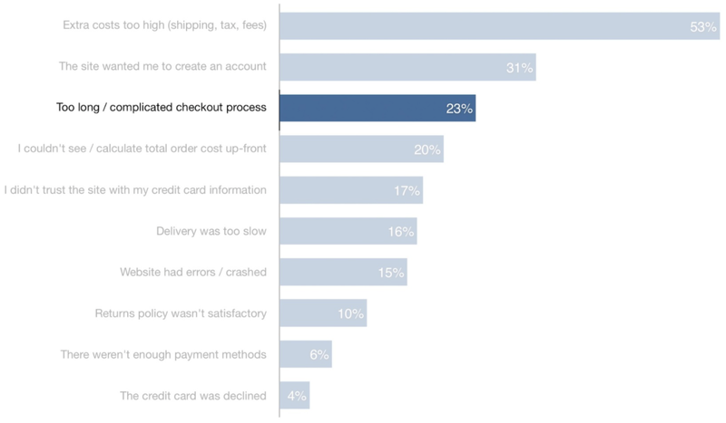
Figure 1
It's important to note when consumers have the perception of a mobile checkout being "too long" or "too complicated" this needs to be unpacked further. The reason for this is, there are other findings in the above research which correlate to mobile checkouts being too complicated.
Some examples...
1. Any checkout can be perceived as being "too long" if it's being perceived as being "too complicated".
2. The second trend in Figure 1: "The site wanted me to create an account". Many checkouts offer "Guest Checkout" but it's not clear and obvious. So while the consumer can't easily find this option, the root of the issue is the complication.
3. The fifth trend in Figure 1: "I didn't trust the site with my credit card information". When consumers have a difficult/unpleasing checkout experiences the trust in the checkout dwindles to the point where consumers no longer want to provide their secure information.
4. The seventh trend in Figure 1: "Website had errors/crashed". Remember the definition of "error" to a consumer. This could be anything that relates to messages appearing in the checkout that says something is not right. This is often "error messages" signaling the consumer has entered the wrong information into a input field in the checkout.
It all comes down to the issue the mobile checkout is perceived to be too complicated.
What makes mobile checkouts "Complicated"?
Below are some examples of what makes mobile checkouts complicated for consumers...
#1. Too Many Form Fields:
There is a direct correlation between the perception of great checkout experiences and the number of form fields used.
Figure 2 is a plot matrix showing the correlation between checkout performance and the number of form fields being used. As the number of form fields lowers, the performance improves.
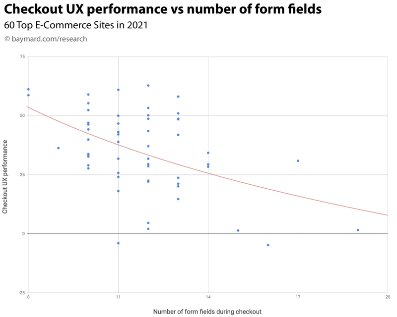
Figure 2
#2. Form fields increase "Interaction Cost":
The actual effort consumers must undertake to fill in information increases fatigue or what's known as "interaction cost" (the cost of interacting with the retailer).
Another way of looking at "interaction cost" is effort: how much effort is a consumer exerting? There are also two types of effort: physical and mental.
When mental effort grows, so too does the perception of complication.
The job of a retailer is to reduce interaction costs (physical and mental effort) as much as possible: see research in Figure 2 above.
This is further supported by research completed by Smart Insights where they surveyed consumers from 9 different global markets to determine what frustrates them when trying to complete a mobile checkout. The graphic in Figure 3 summarises the top trending responses from the research.
The trend titled "Too difficult to input details" is another way to say, the interaction cost becomes higher when inputting information.
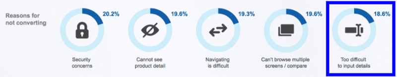
Figure 3
Every consumer must enter their details, at least the first time they are checkout out with a retailer. When seeing data like the above, this indicates the form field entry is complicated.
One of the most well-known issues with form fields on the small screens is the presentation of error messages when information is not correctly entered.
#3. Mobile Error Message Experiences:
When information is not filled out correctly consumers are commonly confronted with confusing and abrupt error messages.
There is a correlation between the number of form fields and the incidence of form field input errors. It is common to incorrectly type information on smartphones.
69% of mobile sites around the world do a poor job of intuitively communicating incorrect form field entry.
What makes this experience a poor one is the messages needed to guide consumers to make a correction.
Myer Example:
One simple example of what not to do can be seen with Myer.
Once consumers reach the Delivery step of the Myer mobile checkout, they enter information into a series of form fields. Once they reach the bottom of the page the consumer selects the call to action titled, "Check Delivery options": see Figure 4 below.
However, incorrect information has been entered in one of the form fields higher up on this page which is out of view for the consumer.
The issue comes in what happens once the consumer selects the call to action "Check Delivery Options". Nothing happens.
There are error messages at the top of the page, but the consumer cannot see it. He/she will become confused and think the cart is broken and lose trust and will not want to enter their credit card details.
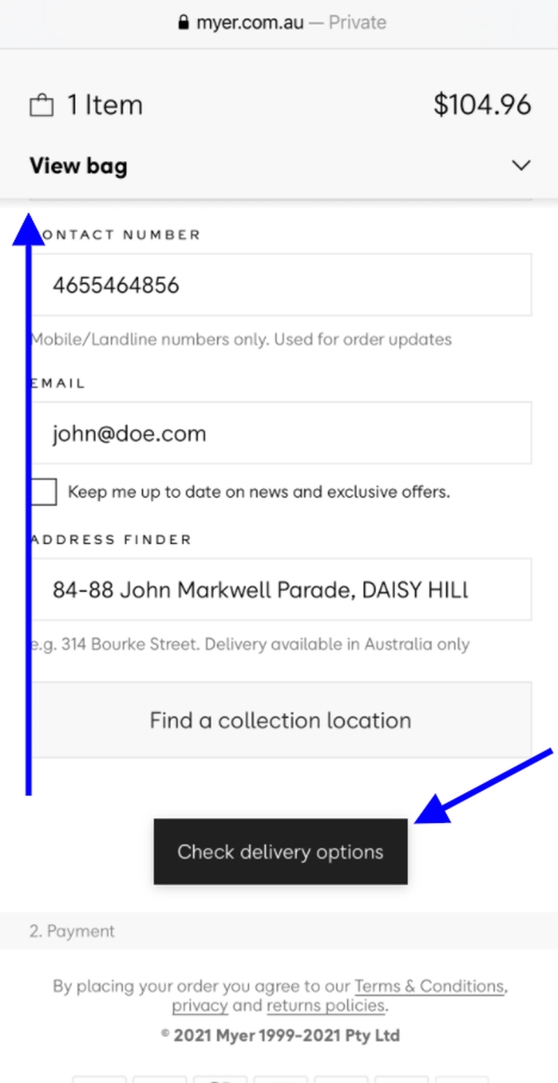
Figure 4
This experience, happening on Myer, is very similar to the trends seen in Figure 1 above.
Target USA Example:
By way of comparison, the Target USA mobile site has a strong visual presentation of what form fields require further attention when errors are made (see Figure 5 below).
Not only does the page slide up to show these messages, Target uses personal language such as "Please" to soften this potentially frustrating experience.
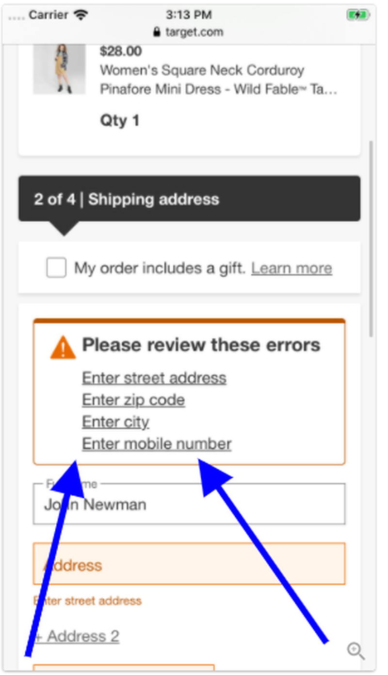
Figure 5
Too often error messages are cold and abrupt. But why is that?
Answer: they are written by developers.
Conclusion:
There are many things that need to be done to improve mobile checkouts but when retailers struggle to know where to start, the advice is to consider the research above and the recommendations below.
#1. Stay away from one-step checkouts. They have never been designed for mobile screens. As a business offers more delivery/pick-up options, having a dedicated step in the checkout simplifies the experience.
#2. Introduce a mobile "Progress Bar" to simplify the ability for consumers to move back and forth in the checkout. This element also sets expectations as to how many steps there are to complete the process.
There are a number of micro-details that must be in place to create amazing mobile checkouts.
For example, the activation of a Progress Bar has many benefits to make the experience a simple one.
#3. Reduce the form fields needed to complete the process. Even starting with an address verification step where technology eliminates the need to enter the entire home delivery address can reduce the consumer's interaction cost.
#4. Take out all the default error messages (written by developers) and replace them with personable statements that are in-brand.
#5. Improve the intuitive nature of error message presentation and make it simple for consumers to understand what they have done wrong.
If a retailer can achieve the above, they will see improvements in mobile checkout conversion rates and set the foundation for future enhancements.
This article was as tagged as Best Practice , Digital Strategy , eCommerce Conversion Rate Optimisation , UX Design