
There is an ongoing debate as to which checkout flow is superior: “multi-step” vs “one-step” checkout.
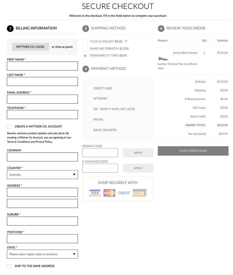
To be clear on the definition of each, the one-step checkout is essentially the entire checkout process on a single page (see screenshot below). All form fields across all steps are presented on a single page.
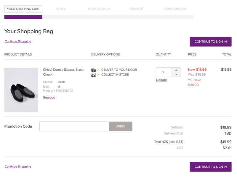
The multi-step checkout is characterized by taking the information (seen above) and breaking it down into multiple pages. To assist with this is a progress bar to set expectation and deliver transparency as to the number of pages and the effort required to complete.
See an article written on the best practice progress bar.
To answer which checkout flow is superior first requires the right question...
What is the best checkout approach for a consumer to easily complete a transaction across all screen types?
With this in mind, the proper scrutiny of each checkout approach can now be applied.
Consumer Journey Context:
To answer the above question first requires clarity on what the checkout experience means to the consumer.
Before the consumer starts the checkout experience, he/she will have had full control of every aspect of seeking out and engaging with product and content.
This sense of control is a key part of creating amazing experiences. However, once the checkout process begins, the consumer loses all sense of control and is at the mercy of set processes dictated by the retailer and the requirements needed to confirm a transaction.
And because the checkout process demands certain steps to be followed, it needs to be easy effortless to keep consumers from leaving.
So how does this expectation translate to these two different checkout flows?
To break the suspense, it's the one-step checkout that is failing.
Below is a list of reasons as to why...
#1. Not designed for smartphones:
The one-step checkout was designed for large desktop screens where the entire checkout could be seen in view (see the example above). The ability to see the entire process in view on a single page on desktop screens can be appealing and simplify the process.
However, the dominance of the smartphone has changed this dynamic considerably. Trying to navigate the entire checkout process in one step on a small screen is difficult and confusing.
#2. Click and Collect wasn’t a “thing”:
The one-step checkout was a popular choice when there was only one delivery option: delivery to home. This made the delivery section of the one-step simple and uncomplicated.
Today, customers expect many options and retailers work hard to offer multiple delivery-to-home options (slow or fast) and multiple pick-up options (click and collect, lockers, pick up at other retail sites).
To apply these choices in a one-step checkout system and have it display elegantly on smartphone is impossible.
The extension to this issue of multiple options in a single step also applies to the payment step. This step in the checkout is now burdened with multiple payment methods. If they are not presented in a simple and elegant manner it will confuse people.
#3. Visually Intimidating:
Long pages of forms intimidate consumers, resulting in a higher incidence of abandonment. Imagine the above one-step checkout stacked from top to bottom.
The multi-step checkout creates digestible mini-steps allowing the consumer to tackle information entry one step at a time.
#4. Error Notification:
Imagine a consumer entering all his/her information on a one-step checkout (on a smartphone screen), but once he/she is done selects the final “Confirm Order" button, an error message displays. The consumer must then scroll back through all fields to find what went wrong.
The right multi-step checkout experience delivers “micro validation points” to verify the information entered during a specific step has been captured and is correct.
The ability to show the consumer the system (eCommerce technology) has captured information at certain steps, provides comfort.
#5. Speed:
Forcing a high volume of functional elements to display on a single page increases the pageload time of the checkout. This issue is exacerbated on smartphone screens along with the need to often apply database inventory checks and activate freight table logic while the cart is loading.
One step checkout has a reputation of being slow.
#6. Behavioural Monitoring:
What cannot be monitored cannot be fixed. Because the one-page checkout is literally on one page, there is little insight that can be gained from monitoring engagement with this checkout type.
Retailers struggle to construct behavioural sales funnel data to identify issues because there aren't any. And with the introduction of multiple pick-up options on the delivery step, this becomes an important part of enhancing checkout experiences in the future.
#7. “Interaction Cost” is high:
The single most important method in creating intuitive and seamless online experiences is through the reduction of “interaction cost”: this is the level of effort the consumer must exert when engaging with a retailer. And in this case, the checkout.
A retailer will never entirely eliminate “interaction cost” but it can be reduced. “Interaction Cost” is made up of two forms of effort: physical and mental.
- “Physical” comprises all the actions a consumer takes to drive engagement: tapping, clicking, scrolling, swiping, pinching etc..
- “Mental” is the thinking or cognitive exertion a consumer needs to take to complete a task
Some examples of mental effort in the checkout:
- Making consumers remember a coupon code to apply a discount
- Once the coupon code is applied no visual validation is displayed to show the coupon has been activated
- Having consumers search for input errors on a one-step checkout
Retailers think they are reducing interaction cost with one-step checkouts because it's one step. The reduction of steps from four down to one is, in theory, a dramatic reduction in physical effort.
When creating the checkout experience design, no one considers the mental effort involved. This is one of the most common misconceptions of experience design.
However, as seen above with the issues of the one-step, there is a heightened level of “mental effort” which in turn elevates interaction cost.
To reduce interaction cost requires a combination of physical and mental effort to be simultaneously reduced.
When designing the ideal checkout for your customer, look at your customers and visualize how they need to transact with you on smartphones and take into consideration the mental effort (or cognitive load) required to complete a transaction.
Once you take on this perspective, the multi-step checkout flow becomes the clear winner.
Benefits of working with an eCommerce Expert = Results:
When you work with an eCommerce Expert like Greg from Comma Consulting, these are the types of results you can expect...
Ready to grow? Let's Go! Click here to contact Comma Consulting now.
This article was as tagged as eCommerce Consulting , UX Design