Smartphone touch targets (buttons, links etc) are typically too small. Behavioural research proves the minimum size should be 1cm × 1cm (0.4in x 0.4in).
To drive engagement on small screens requires the proper visual treatment of buttons/links throughout a site. There are three visual characteristics to abide by...
- The size of the touch targets
- The “screen density” (the space around each touch target)
- Set expectation (increased size allow consumers to discern what the target represents)
Why is this so important?
MIT’s Touch Lab found the average person’s fingertips are 1.6 - 2cm (0.6 - 0.8 inches) wide (thumb is larger).
Behavioural research proves when smartphone touch targets are too small, users take longer to tap them (Google “Fitts’ Law” to learn more).
This is because of the increased precision needed to make the right selection. Fitts' Law proves the improper treatment of touch targets increases a consumer's effort to engage.
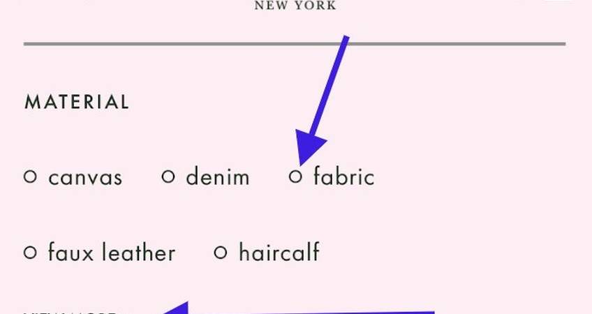
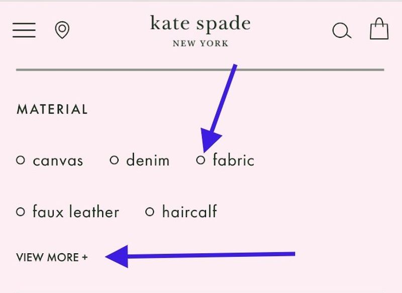
An example in action can be seen when consumers try to engage with Kate Spade to activate filters. Though the spacing is good, engagement can be improved by increasing the size of the "circles" and the "View More" link.
It's not obvious these filters can be activated by tapping the entire word (such as "fabric").
To learn more about touch targets and the best practice treatment of these action elements throughout a smartphone site, get access to my best practice 4-book series, click here.
To understand more about what this digital best practice book series will teach you, click here.
This article was as tagged as Best Practice , eCommerce Conversion Rate Optimisation , UX Design