
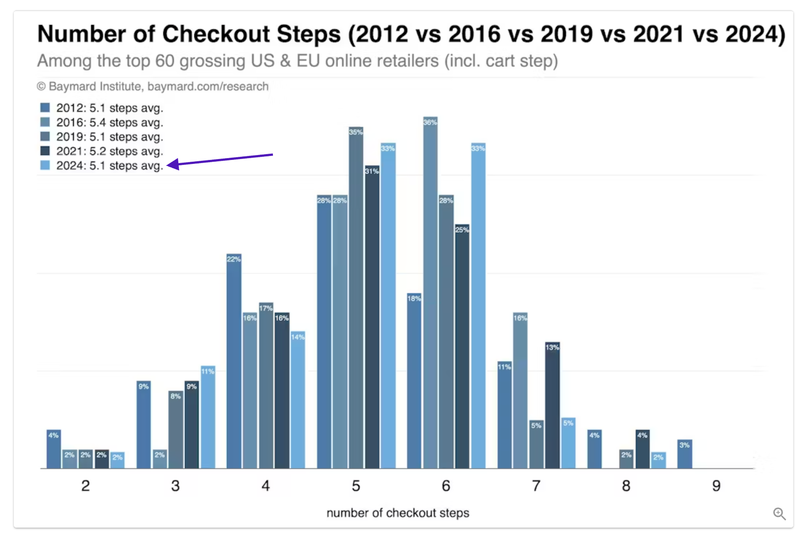
Research in 2024 has come forward proving the top-performing online retailers worldwide average 5.1 Checkout Steps and have less than 11 form fields for first-time purchasers.
New research has shown these two characteristics are consistent across all of the top-performing checkouts in the world. If you are in the process of re-platforming and need to reconsider how your checkout should look and behave, this research will help.
This research contradicts the 1 to 2 step checkout flows, which many say are the "golden rule" for great checkout experiences.
This is simply untrue.
Please remember, when counting steps in a checkout flow, we must include the cart step.
Why are more steps leading to more conversions?
To unpack this further, there are four primary reasons as to why 5 checkout steps are winning...
#1. Number of Form Fields:
As stated above, there is a direct correlation between the number of form fields and checkout conversion rates. The greater the number of form fields, the lower the conversion rates.
There are many ways to reduce form field entry; one example is to combine the "First Name" and "Last Name" form fields into a single field.
One might think there is no need to have 5 steps in a checkout if there are only 11 form fields to fill out. However, the trend of growing delivery and pick up services can be problematic on one step checkouts (see point 2 below).
#2. Delivery and Pick Up Services:
The ongoing growth of the number of delivery and pick-up services offered by retailers (and B2Bs) can be confusing if not presented to a high standard in a checkout flow.
Creating a dedicated checkout step to allow consumers to select a delivery or pick-up service creates less friction for people.
A key point to note here is, there does not need to be form fields when selecting a delivery or pick up. Radial buttons and tick boxes can and should be used. These are not classified as " form fields," which require people to provide information the system does not have.
So while the research states the top retailers have 11 form fields or less, this does not include the need for consumers to choose delivery/pick up preferences.
#3. Validation of information entry is achieved at each step:
In a one-step checkout, consumers are asked to complete a lot of information in a single step. If one form field is entered incorrectly (a common occurrence on mobile devices), the consumer must scroll through the entire checkout flow to find the issue.
This increases mental and physical effort and results in people leaving the checkout without purchasing (research verified).
However, when the checkout flow is broken down to smaller steps, the ability to present form entry errors is far more elegant and easier for consumers to find and correct.
This is why "form-error-experiences" must be designed for mobile screens: a crucial consideration in planning.
#4. Mobile Devices:
One-step checkouts are proven to be hard work on mobile devices, and the checkout flows with 5 steps are clearly winning for the reasons mentioned above.
Everything is harder to complete on small screens. Consumers are entering information using their fingers and a small keypad, not a keyboard.
For retailers, this means that extra effort is required to reduce the mental and physical effort required to complete a checkout flow on small screens.
5. "Physical" vs "Mental" Effort:
Understanding the dichotomy of "physical" vs. "mental" effort is essential because this is a key reason why one-step checkouts are underperforming.
A "one-step" checkout is appealing because it appears to reduce the physical effort needed to complete the process. However, cramming an entire checkout flow into a single step (or two steps) increases consumer confusion and the mental effort needed to complete it.
Reducing mental effort is more critical than physical effort. This is the foundation of best practice UX Design principles.
6. Progress Bar:
The use of a best-practice progress bar is a key element in driving checkout completions and is commonly found on checkout flows with 4 to 5 steps.
The progress bar is a proven psychological device that gives people cues of their progress and simplifies their ability to take back steps (a typical consumer behaviour in checkouts). This functional element is known to reduce a consumer's mental effort.
Click here to learn more about the best practice progress bar in checkout flows.
Conclusion:
This research cannot be ignored. It's recognised there are certain eCommerce Platforms who support the fewer steps in checkout flows, but understand the biased stance being taken here.
The reality is, numbers don't lie.
Most businesses will not understand this type of research and how it needs to be applied in planning, but this is all answered in UX Design planning.
If you are interested, email Greg Randall to see how he can help. He has designed hundreds of highly successful checkouts for retailers worldwide.
Click here to see all this research.
This article was as tagged as Digital Transformation , eCommerce Consulting , eCommerce Conversion Rate Optimisation , UX Design