
Organisations invest heavily in content strategies, creating content to assist in information gathering and online buying. However, over 95% of businesses forget a critical part of the content plan: error messaging.
An error message can occupy an entire page (such as page not found) or it can be a small subtle message relating to the incorrect entry of information (such as in the shopping cart).
Remember who has written these messages: Developers! Please do not misinterpret this statement, some of my best friends are developers, but I would never let them speak to my client's customer: sorry, but it's true).
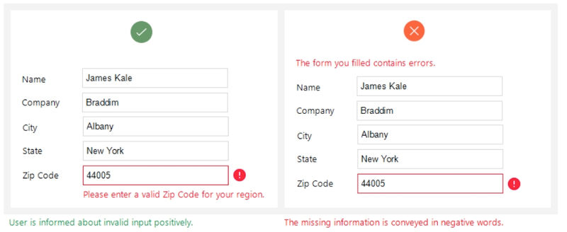
There is no need to write a book! Even simple messaging makes a big different. Have a look below where the example on the right is polite and the message location is beside the field where the correction is required: location of message is also crucial.
By not changing error messaging, businesses are essentially allowing developers to inform customers they have done something wrong.
How do you think that goes down?
Imagine the feeling a customer would get when arriving on a broken page and have the content presented below...
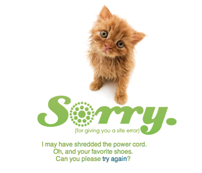
This is infinitely better than a generic, "you have arrived on a broken page" message.
The solution? Conduct an "error message" project where every single error scenario is identified and the business creates content (in brand voice) to be used in these situations.
Look at this as an opportunity to expose customers to brand voice and offer helpful content to get them back on track, not as something the customer has down wrong and they should feel shame.
UX Planet has a great article on how to right great error messaging content (click here to read).
This article was as tagged as eCommerce Conversion Rate Optimisation , UX Design